The React DateTime Selector is a control for React. It makes a more customizable UI and allows date and time picking intricacies.
It provides with the option of selecting the default year, month, date, hours and minute.
Initial UI
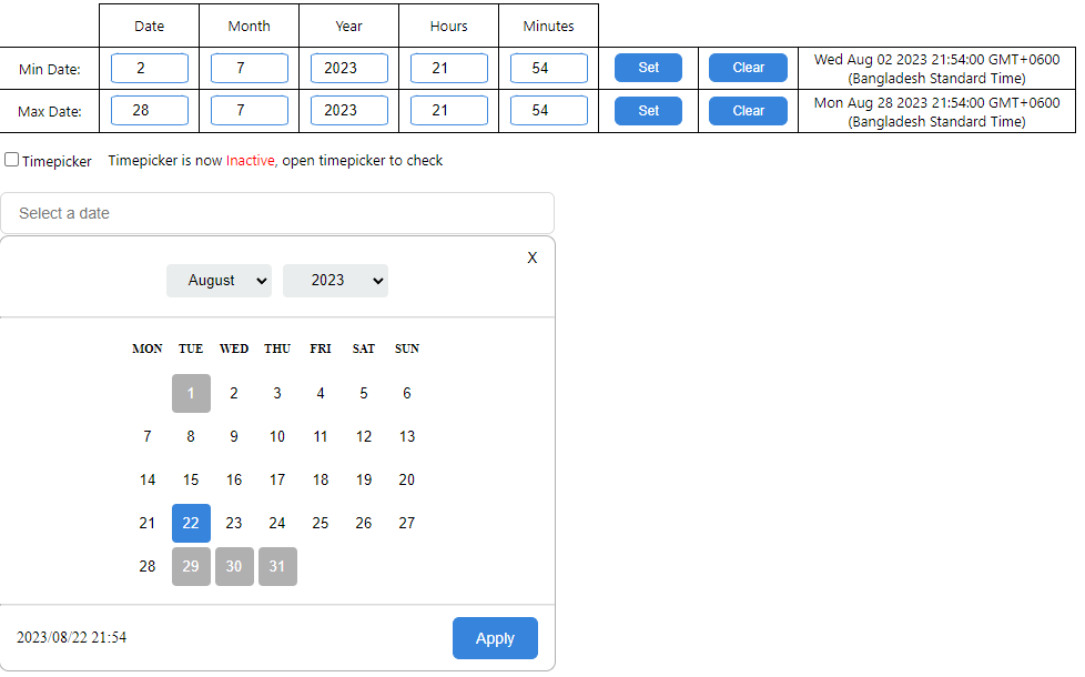
- The current value for the picker is set to the current day and time.
- It can be changed as per requirement by passing a Date object.
- Allows selection of the minimum and maximum values for range.
- Option to set Minimum date
- Added a minimum range option that allows a dynamic date value to be passed
- Selecting any date or time before the minimum value that is set is not possible
- Option to set Maximum date
- Added a maximum range option that allows a dynamic date value to be passed
- Selecting any date or time beyond the maximum value that is set is not possible
- Noticeable updates to the UI
const [dateVal, setDateVal] = useState<Date | null>(null);
<Datepicker
width="500px"
value={dateVal}
onChange={(date) => {
setDateVal(date);
}}
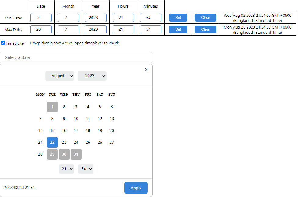
timepicker={true}
/>;After activating Datepicker
Version Update: 1.0.5
- The timepicker is turned off by default, and can be added by a property called "timepicker"
For implementation, the Datepicker components needs to be imported to the component.
- The state of the Datepicker is held in a state, typed as a Date or null value
- The onChange function works to get the newly set state back and update the original state variable
const [dateVal, setDateVal] = useState<Date | null>(null);

<Datepicker
  width="500px"
  value={dateVal}
  onChange={(date) => {
    setDateVal(date);
  }}
/>;
Update 07.06.23
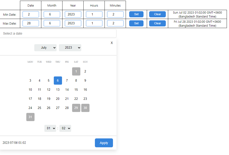
As of the current release (1.0.1), it is possible to add a range for minimum and maximum value in the datepicker, before and after which selection will not be possible respectively.
A single Date object can be passed into the Datepicker for both the minimum and the maximum value, the prop names being min and max for each.
const [dateVal, setDateVal] = useState<Date | null>(null);

<Datepicker
  width="500px"
  value={dateVal}
  onChange={(date) => {
    setDateVal(date);
  }}
  min={new Date("2023-07-02 01:02:00")}
  min={new Date("2023-07-28 12:55:00")}
/>;
Alternatively, the minimum and maximum can also be kept inside states in order to update them when needed.
const [dateVal, setDateVal] = useState<Date | null>(null);
const [min, setMin] = useState<Date>("2023-07-02 01:02:00");
const [max, setMax] = useState<Date>("2023-07-28 12:55:00");

<Datepicker
  width="500px"
  value={dateVal}
  onChange={(date) => {
    setDateVal(date);
  }}
  min={min}
  max={max}
/>;
Note: Minimum and maximum ranges can work independently, i.e. one does not need to be set for the other to work
Updated UI after setting the minimum and maximum values respectively
Deployed here in Vercel Developed with: TypeScript, React JS.