Conversation
|
Size Change: 0 B Total Size: 1.2 MB ℹ️ View Unchanged
|
 enejb
added
the
Mobile App - i.e. Android or iOS
enejb
added
the
Mobile App - i.e. Android or iOS
|
Just pushed a change that updates the dark mode to And light more do |


 enejb
force-pushed
the
RN/add-border-color-tokens
branch
from
enejb
force-pushed
the
RN/add-border-color-tokens
branch
from
b634d70 to
478ffc8
Compare
|
This PR focuses on border colors, but I just want clarify one aspect of this, dashed border colors. Looking at the changes regarding dashed border colors, I see:
What I don't understand is where these conversions are coming from, could you please clarify this? Also, I'm not able to test this unfortunately, the branch needs updating and I get quite a few linter errors when running |
@guarani Good question! They're discrete values, chosen specifically so that the optical weight of the dashed border is roughly the same as the standard border when side-by-side. |
|
Un-assigning myself here as I'm no longer working on the editor part of the app. |
|
I am closing this now since I think we should come up with a different approach to unifying the colours in the editor. This PR was trying to do too much. |
3 participants
Description
This PR updates deprecates the following colour variables.
and replaces them with
$neutral-dim-light: rgba($black, 0.12);and
$neutral-dim-dark: rgba($white, 0.15);While at the same create a few different
design tokenswhich make it easier to update the colours in the future.How has this been tested?
This has been tested using the demo app on both Android and iOS. In light and dark mode.
Screenshots
In order to make the different changes easier to see. I made the
following changes to the
_colors.native.scssfile.Highligheted colours
$border-color and $border-color-dark Column Block 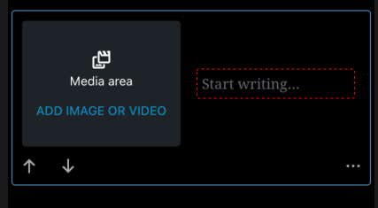Media Text Block

Cover Block

Buttons Block

Contact Info Block

$modal-border-color and $modal-border-color-dark
Toolbar

Model colours


.

$drag-indicator and $drag-indicator-dark.
Notice the yellow drag handle.

$spacer-color and $spacer-color-dark.

Spacer Block
With the true colours.
iOS
Toolbar

Modal


iOS DarkMode


Modal


Toolbar

Android
Blocks
Toolbar

Modal


DarkMode
Blocks
Modal


Toolbar

Types of changes
Color Refactor.
Checklist: