
Seaborn Flights
Attempt #160s total
Seaborn Flights
Monthly airline passenger counts from Seaborn library.
- Built-in Python Datasets
- Time Series
- Beginner
PASSED
60s
Take Your Power BI Models Beyond the Static Dashboard. Register for the live session ➡️

Plotly Studio combines dynamic data exploration with AI agents to build interactive data visualizations and dashboards in minutes. While most AI tools require prompt engineering to get a basic chart, Plotly Studio is built for production-grade reliability.
Every day, we run a CI benchmark against the most popular and complex real-world datasets spanning finance, healthcare, scientific research, and other domains. Each dataset receives three generation attempts for statistical consistency, with zero human guidance or prompts. Our 99.1% success rate means that you can trust Plotly Studio to handle heavy lifting for data analysis.
When you connect your data to Plotly Studio, you get an interactive app based on your data structure and context, suggestions for relevant visualizations, and beautiful visualizations following analytics best practices. From there, you can refine using natural language or Python code.
Browse the results of our benchmark tests below to see how Plotly Studio handles different data types and use cases. Download the underlying data, examine the generated code, or connect your own dataset to see what Plotly Studio builds for you.
Every dashboard generated by Plotly Studio includes fully interactive charts. Hover over data points, zoom, pan, and explore your data dynamically. Try it below!
👆 Hover, click, zoom, and drag to explore this interactive chart
302 Apps Generated Daily (302 datasets × 3 attempts each)
Browse 302 AI-generated dashboards across 21 categories
4 datasets
Seaborn Flights
Attempt #160s total
Seaborn Flights
Monthly airline passenger counts from Seaborn library.
60s

Statsmodels Macroeconomic
Attempt #160s total
Statsmodels Macroeconomic
US macroeconomic time series from statsmodels library.
60s
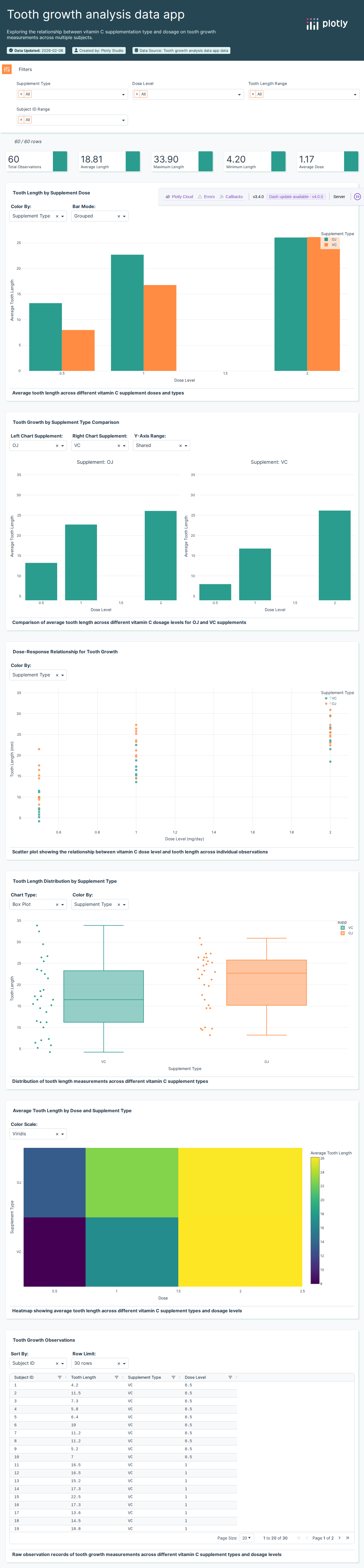
Tooth Growth Study
Attempt #160s total
Tooth Growth Study
Vitamin C effect on guinea pig tooth growth.
60s

Motor Trend Cars (Alt)
Attempt #160s total
Motor Trend Cars (Alt)
Motor Trend car road tests dataset variant.
60s
19 datasets

Supermarket Sales Analytics
Attempt #174s total
Supermarket Sales Analytics
Supermarket transaction data with product categories and margins.
74s

Coffee Flavor Profiles
Attempt #164s total
Coffee Flavor Profiles
Coffee flavor profile data with tasting notes and origins.
64s

Michelin Restaurant Reviews
Attempt #1194s total
Michelin Restaurant Reviews
Michelin restaurant reviews with ratings and cuisine types.
194s

Amazon Sales Data
Attempt #184s total
Amazon Sales Data
Amazon product sales data with categories and revenue metrics.
84s

Retail Sales Performance
Attempt #168s total
Retail Sales Performance
Point-of-sale retail data for sales performance analysis.
68s

Craft Beer Database
Attempt #198s total
Craft Beer Database
Craft beer database with styles, ABV, and brewery info.
98s

Walmart Store Expansion (1962-2006)
Attempt #176s total
Walmart Store Expansion (1962-2006)
Historical Walmart store expansion data from 1962 to 2006.
76s

Project Management Sample
Attempt #176s total
Project Management Sample
Sample project management data with tasks and timelines.
76s

Restaurant Directory
Attempt #1152s total
Restaurant Directory
Restaurant database with locations, cuisines, and ratings.
152s

Retail Transaction Data
Attempt #1170s total
Retail Transaction Data
Retail transaction data analyzing sales patterns and trends.
170s

Pizza Restaurant Sales
Attempt #166s total
Pizza Restaurant Sales
Restaurant sales data analyzing pizza orders by type, size, and time.
66s

Telecom Customer Churn
Attempt #184s total
Telecom Customer Churn
Customer churn analysis dataset from IBM for telecom industry.
84s

Consumer Complaints (26K)
Attempt #160s total
Consumer Complaints (26K)
Consumer financial complaints dataset with 26,000 records.
60s
Amazon Purchases Sample
Attempt #160s total
Amazon Purchases Sample
Sample Amazon purchase history and product data.
60s

Iowa Liquor Sales (2021)
Attempt #160s total
Iowa Liquor Sales (2021)
Iowa liquor sales data for 2021.
60s

Michelin Restaurants
Attempt #160s total
Michelin Restaurants
Michelin star restaurant data curated collection.
60s

Sales Success Metrics
Attempt #160s total
Sales Success Metrics
Sales performance and success metric data.
60s

Coffee Flavors Sunburst
Attempt #160s total
Coffee Flavors Sunburst
Coffee flavor hierarchy data for sunburst charts.
60s

TripAdvisor Reviews
Attempt #160s total
TripAdvisor Reviews
TripAdvisor hotel review and rating data.
60s
11 datasets

ThermoProSensor Export
Attempt #1138s total
ThermoProSensor Export
Temperature sensor export data from industrial monitoring.
138s

Precipitation Data (June 2015)
Attempt #165s total
Precipitation Data (June 2015)
Daily precipitation measurements from weather stations.
65s

Seattle Weather (2016)
Attempt #172s total
Seattle Weather (2016)
Seattle weather data including temperature and precipitation for 2016.
72s

Environmental Emissions
Attempt #174s total
Environmental Emissions
Environmental emissions tracking data by source and type.
74s

Weather Sensor Readings
Attempt #1120s total
Weather Sensor Readings
Weather station sensor readings with atmospheric data.
120s

Historical Rainfall Data
Attempt #1114s total
Historical Rainfall Data
Historical rainfall measurements across multiple weather stations.
114s

New Zealand Weather Data
Attempt #1104s total
New Zealand Weather Data
New Zealand weather station data with temperature and precipitation.
104s
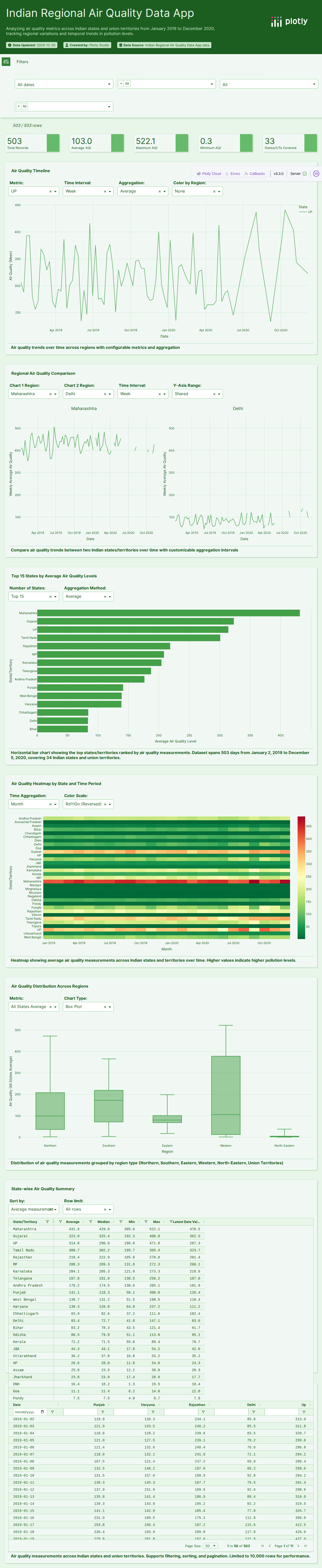
Air Quality Data
Attempt #160s total
Air Quality Data
Air quality measurement data with pollutant levels.
60s

Streamtube Wind
Attempt #160s total

Public Well Water
Attempt #160s total
Public Well Water
Public well water quality and location data.
60s

Wind Measurement Data
Attempt #160s total
Wind Measurement Data
Wind speed and direction measurement dataset.
60s
1 dataset

3D Mesh Helicopter
Attempt #160s total
3D Mesh Helicopter
3D mesh coordinates for helicopter model visualization.
60s
6 datasets

AI Task Automation Potential
Attempt #192s total
AI Task Automation Potential
AI task automation potential analysis by occupation.
92s

AI Industry Salaries
Attempt #178s total
AI Industry Salaries
AI industry salary data by role, experience, and location.
78s

O*NET Occupational Tasks
Attempt #1132s total
O*NET Occupational Tasks
O*NET occupational task descriptions for workforce analysis.
132s

Commencement Speeches
Attempt #160s total
Commencement Speeches
University commencement speech data and speakers.
60s
Graduate Students
Attempt #160s total
Graduate Students
Graduate student enrollment and demographics data.
60s
School vs. Earnings
Attempt #160s total
School vs. Earnings
School type and graduate earnings data.
60s
5 datasets

Wind Speed Analysis
Attempt #194s total
Wind Speed Analysis
Wind speed and direction data for energy analysis.
94s

UK Power Networks Data
Attempt #1108s total
UK Power Networks Data
UK Power Networks electricity distribution data.
108s

Wind Speed (Laurel, Nebraska)
Attempt #1122s total
Wind Speed (Laurel, Nebraska)
Wind speed measurements from Laurel, Nebraska.
122s
India Power Consumption
Attempt #1112s total
India Power Consumption
India electricity consumption data by region and sector.
112s

Wave Energy Converter (Sydney)
Attempt #1121s total
Wave Energy Converter (Sydney)
Wave energy converter performance data from Sydney.
121s
19 datasets
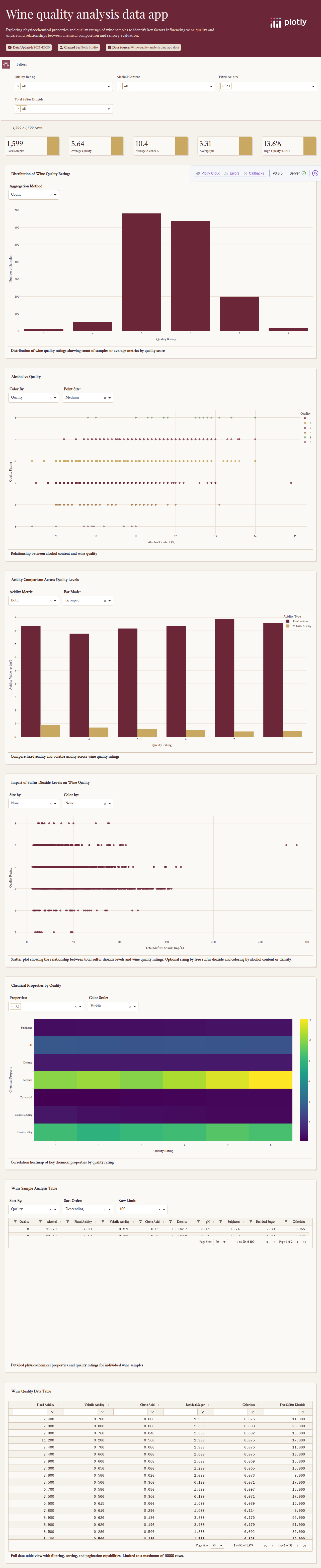
Fortified Wine Quality
Attempt #1162s total
Fortified Wine Quality
Portuguese fortified wine quality ratings and chemical properties.
162s

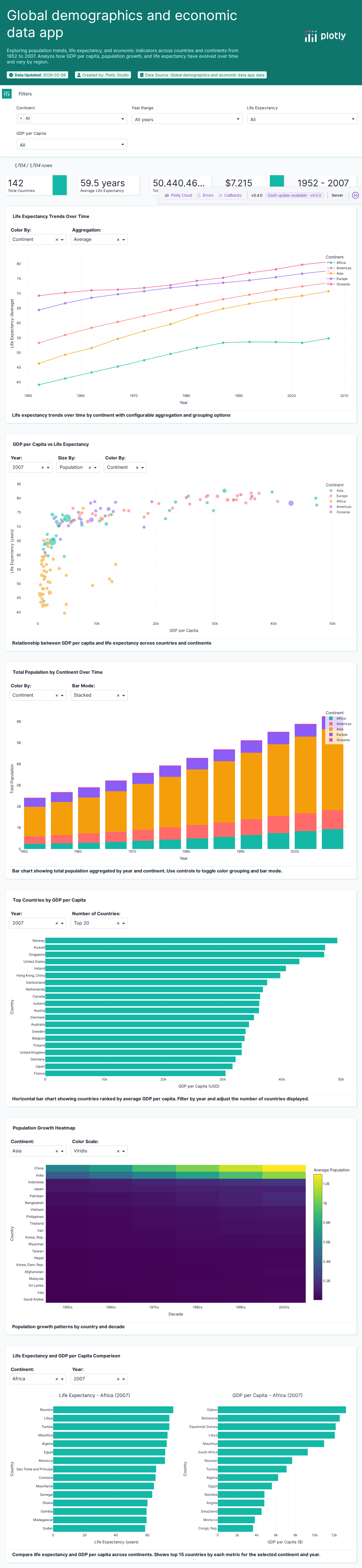
Gapminder Life Expectancy
Attempt #1124s total
Gapminder Life Expectancy
Gapminder life expectancy data by country and year.
124s
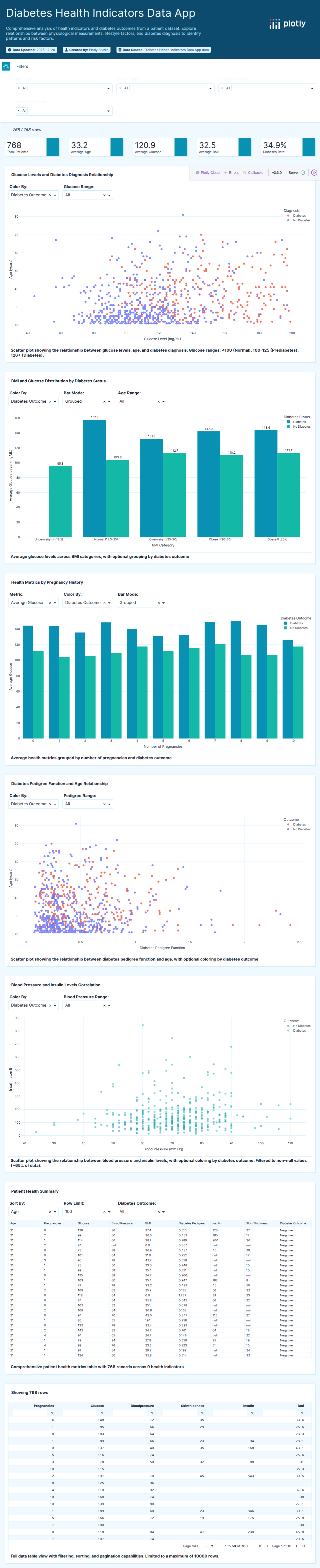
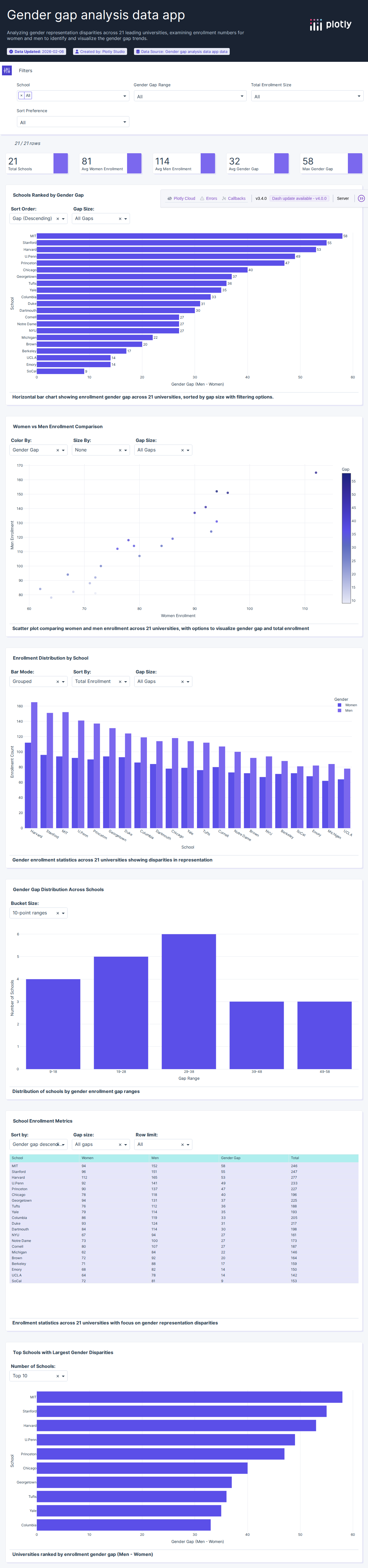
Diabetes Health Indicators
Attempt #196s total
Diabetes Health Indicators
Medical diabetes dataset for predictive health analysis.
96s

Titanic Passenger Survival
Attempt #196s total
Titanic Passenger Survival
Titanic passenger data for survival prediction analysis.
96s

Titanic Passenger Data
Attempt #1138s total
Titanic Passenger Data
Titanic passenger survival data with demographics and cabin info.
138s

Iris Flower Dataset
Attempt #1110s total
Iris Flower Dataset
Classic Fisher iris flower dataset with petal and sepal measurements.
110s

Iris Dataset (Plotly Express)
Attempt #188s total
Iris Dataset (Plotly Express)
Plotly Express iris dataset for data visualization examples.
88s

Monthly Milk Production
Attempt #190s total
Monthly Milk Production
Agricultural time series of monthly milk production volumes.
90s
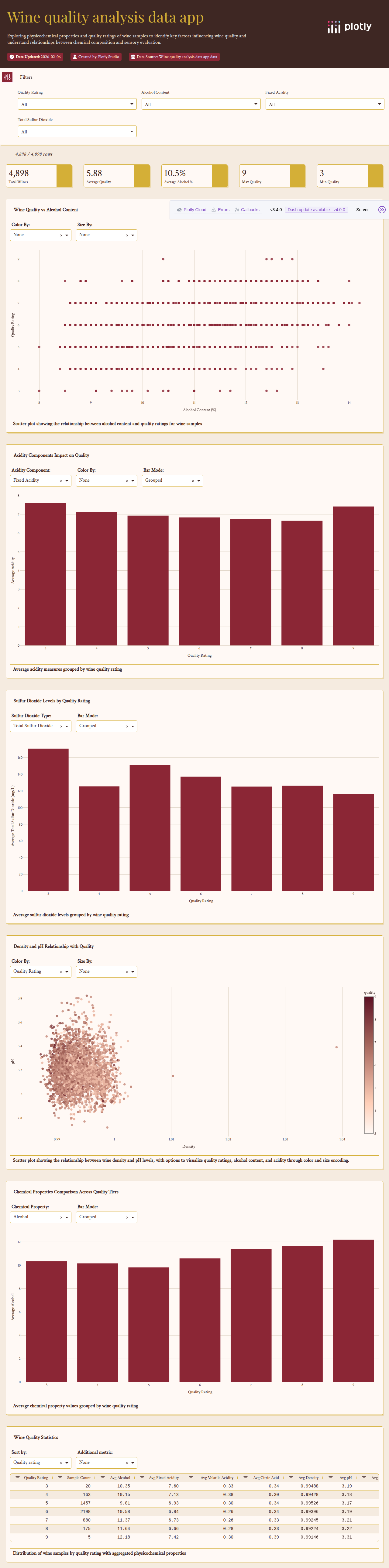
Red Wine Quality
Attempt #1178s total
Red Wine Quality
Red wine quality ratings with chemical analysis.
178s

Restaurant Tips (Plotly Express)
Attempt #178s total
Restaurant Tips (Plotly Express)
Plotly Express tips dataset for interactive visualization demos.
78s

Restaurant Tips Dataset
Attempt #166s total
Restaurant Tips Dataset
Restaurant tipping data analyzing gratuity patterns and factors.
66s

Motor Trend Car Road Tests
Attempt #182s total
Motor Trend Car Road Tests
Classic R mtcars dataset with automobile performance data.
82s

Palmer Penguins
Attempt #160s total
Palmer Penguins
Palmer Archipelago penguin species measurement data.
60s

Anscombe's Quartet
Attempt #160s total
Anscombe's Quartet
Anscombe's quartet demonstrating statistical visualization importance.
60s

Datasaurus Dozen
Attempt #160s total
Datasaurus Dozen
Datasaurus Dozen dataset for statistical visualization.
60s
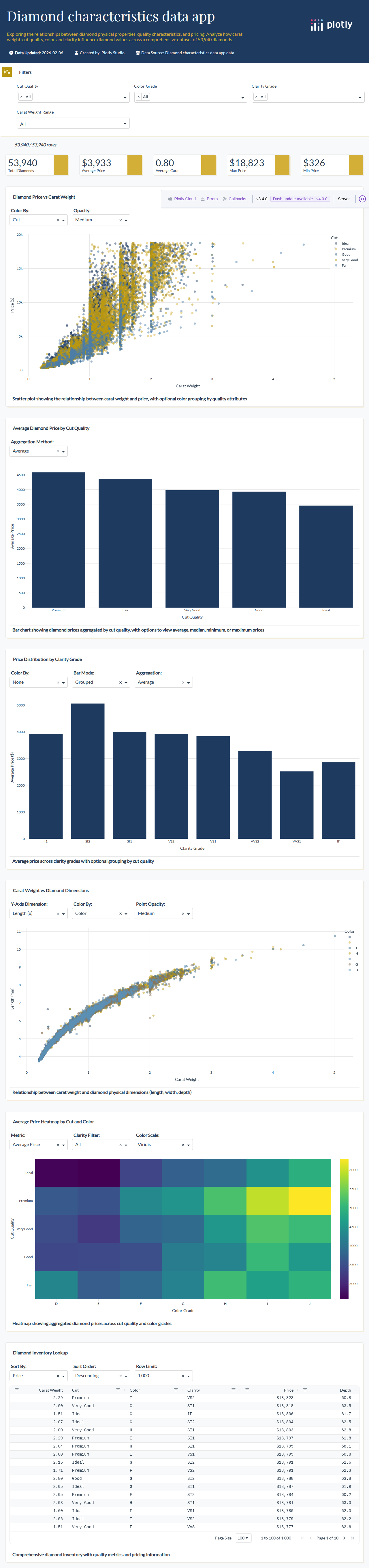
Diamonds Dataset
Attempt #160s total
Diamonds Dataset
Diamond price and quality characteristics dataset.
60s
Gapminder Five Year
Attempt #160s total
Gapminder Five Year
Gapminder development indicators at 5-year intervals.
60s

Iris Flower Data
Attempt #160s total
White Wine Quality
Attempt #160s total
White Wine Quality
White wine quality ratings with chemical analysis.
60s
20 datasets

Apple Stock Price (2014)
Attempt #182s total
Apple Stock Price (2014)
Apple stock price history and trading data for 2014.
82s

Tesla Stock Price History
Attempt #192s total
Tesla Stock Price History
Tesla stock historical prices with trading volume data.
92s

World GDP by Country (2014)
Attempt #192s total
World GDP by Country (2014)
World GDP data by country with ISO codes for 2014.
92s

Stock Portfolio Template
Attempt #182s total
Stock Portfolio Template
Stock portfolio template data for financial dashboards.
82s

Wage Rigidity Analysis
Attempt #1132s total
Wage Rigidity Analysis
Economic wage adjustment and rigidity analysis data.
132s

Monetary Policy Transmission
Attempt #1128s total
Monetary Policy Transmission
Central bank monetary policy transmission data.
128s

Google Stock Daily Prices
Attempt #1124s total
Google Stock Daily Prices
Google stock daily price data with volume and trading metrics.
124s

UK Balance of Payments
Attempt #1166s total
UK Balance of Payments
UK international trade balance of payments data.
166s
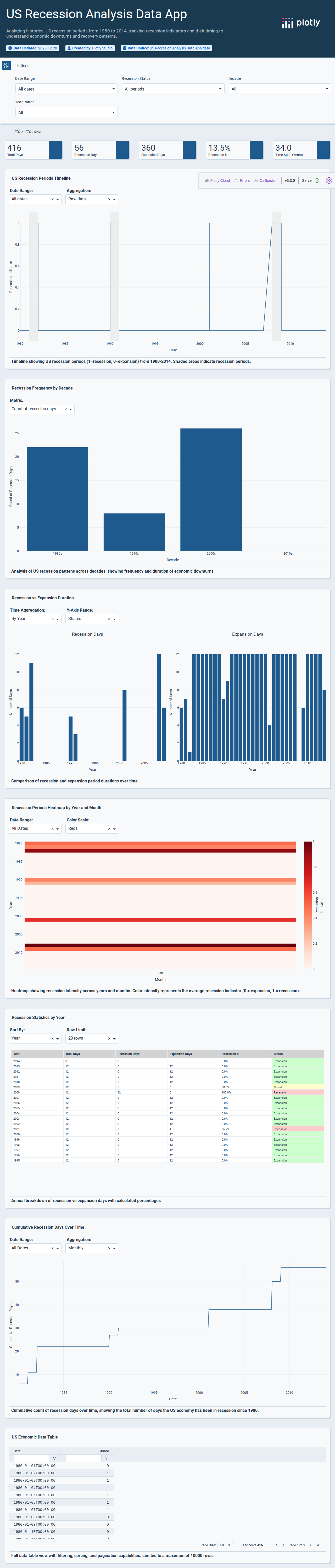
Economic Recession Data
Attempt #1148s total
Economic Recession Data
Economic recession indicator data with GDP and employment.
148s

Multi-Stock Portfolio Data
Attempt #182s total
Multi-Stock Portfolio Data
Multi-stock price data for portfolio analysis and comparison.
82s

Key Macroeconomic Indicators
Attempt #1126s total
Key Macroeconomic Indicators
Economic indicators including GDP, inflation, and employment.
126s

Stock Ticker Database
Attempt #1171s total
Stock Ticker Database
Stock ticker symbols and company information database.
171s

Federal Funds Rate History
Attempt #174s total
Federal Funds Rate History
Federal Reserve interest rate historical data.
74s

Bitcoin Mining (180 Days)
Attempt #1104s total
Bitcoin Mining (180 Days)
Bitcoin mining profitability data over 180 days.
104s

Advanced Historical Data
Attempt #160s total
Advanced Historical Data
Advanced historical time series financial data.
60s

Candlestick Data (2007-2009)
Attempt #160s total
Candlestick Data (2007-2009)
Financial candlestick chart data from 2007-2009.
60s

Stock Ticker Demo
Attempt #160s total
Stock Ticker Demo
Stock ticker demonstration data for Dash applications.
60s

Apple Financial Charts
Attempt #160s total
Apple Financial Charts
Apple financial chart data with OHLC prices.
60s

Hello World Stock
Attempt #160s total
Hello World Stock
Introductory stock price data for tutorials.
60s

State Payroll Data
Attempt #160s total
State Payroll Data
US state payroll and employment statistics.
60s
15 datasets

NASA Global Landslide Catalog
Attempt #1207s total
NASA Global Landslide Catalog
NASA global landslide catalog with geographic and trigger data.
207s

US Airport Traffic (Feb 2011)
Attempt #1108s total
US Airport Traffic (Feb 2011)
US airport passenger traffic statistics for February 2011.
108s

US Agricultural Exports (2011)
Attempt #1104s total
US Agricultural Exports (2011)
US agricultural export data by state for 2011.
104s

Choropleth Map Test Data
Attempt #162s total
Choropleth Map Test Data
Geographic boundary data for choropleth map testing.
62s

American Airlines Flight Paths (Feb 2011)
Attempt #168s total
American Airlines Flight Paths (Feb 2011)
American Airlines flight route data for February 2011.
68s

Bird Migration Tracking
Attempt #1175s total
Bird Migration Tracking
Bird species migration tracking data with GPS coordinates.
175s
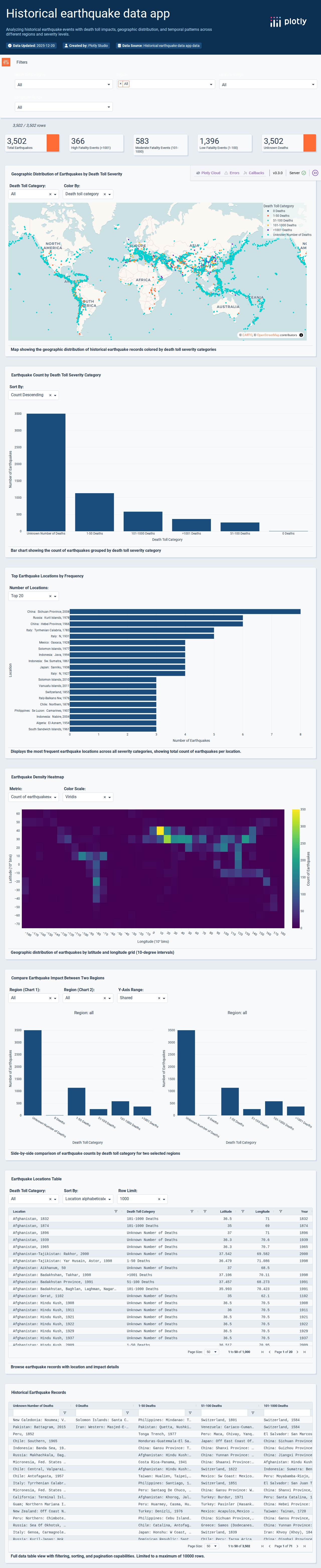
Global Earthquake Data
Attempt #1122s total
Global Earthquake Data
Global earthquake event data with magnitude and location.
122s

Global Volcano Database
Attempt #1165s total
Global Volcano Database
Global volcano database with eruption history.
165s

USA States Data (2014)
Attempt #160s total
USA States Data (2014)
US state-level demographic and geographic data for 2014.
60s
Earthquake Events
Attempt #160s total
Earthquake Events
Earthquake event data with magnitude and coordinates.
60s

Earthquakes (23K Events)
Attempt #160s total
Earthquakes (23K Events)
Large earthquake dataset with 23,000 seismic events.
60s
Globe Contours
Attempt #160s total
Globe Contours
Geographic globe contour data for 3D earth visualization.
60s

Census Tract Urbanization
Attempt #160s total
Census Tract Urbanization
US Census tract urbanization classification data.
60s

Top 1000 US Cities
Attempt #160s total

Volcano Topography
Attempt #160s total
Volcano Topography
Volcano topographic elevation data for 3D surface plots.
60s
46 datasets

San Francisco 311 Requests (May 2025)
Attempt #1129s total
San Francisco 311 Requests (May 2025)
San Francisco 311 service requests and city maintenance data.
129s

FCC Satellite Station Registry
Attempt #174s total
FCC Satellite Station Registry
FCC satellite earth station registration data.
74s

Aurora, CO Municipal Data
Attempt #1126s total
Aurora, CO Municipal Data
Aurora, Colorado municipal data from January 2023.
126s
Nobel Prize Laureates
Attempt #1122s total
Nobel Prize Laureates
Nobel Prize laureates with biographical and award data.
122s

Nuclear Waste Sites on Campuses
Attempt #166s total
Nuclear Waste Sites on Campuses
Nuclear facility locations on US university campuses.
66s

European Political Leaders
Attempt #1120s total
European Political Leaders
European political leaders biographical and tenure data.
120s

311 Animal Complaints
Attempt #160s total
311 Animal Complaints
NYC 311 service requests related to animal complaints.
60s

MTA Ridership Data
Attempt #160s total
MTA Ridership Data
NYC MTA public transit ridership statistics.
60s
Portugal Election (2019)
Attempt #160s total
Portugal Election (2019)
Portugal 2019 election results by district.
60s

US Shooting Incidents
Attempt #160s total
US Shooting Incidents
US shooting incident data with location and details.
60s

Antiquities Act Actions
Attempt #160s total
Antiquities Act Actions
US presidential actions under the Antiquities Act.
60s

Congressional Bills
Attempt #160s total
Congressional Bills
US Congressional bill data with sponsor and status info.
60s

Cabinet Turnover Rates
Attempt #160s total
Cabinet Turnover Rates
US presidential cabinet member turnover rates.
60s

Candidate Campaign Visits
Attempt #160s total
Candidate Campaign Visits
US presidential candidate campaign visit locations.
60s

Clustered Congress Voting
Attempt #160s total
Clustered Congress Voting
US Congress voting patterns with cluster analysis.
60s
Congressional Terms
Attempt #160s total
Congressional Terms
US Congressional member term and biographical data.
60s

Delegate Targets
Attempt #160s total
Delegate Targets
US primary election delegate target data.
60s

Democratic Candidates
Attempt #160s total
Democratic Candidates
Democratic presidential candidate polling data.
60s

Democratic Bench Strength
Attempt #160s total
Democratic Bench Strength
Democratic party bench strength and candidate data.
60s

Early Senate Polls
Attempt #160s total
Early Senate Polls
Early US Senate election polling data.
60s

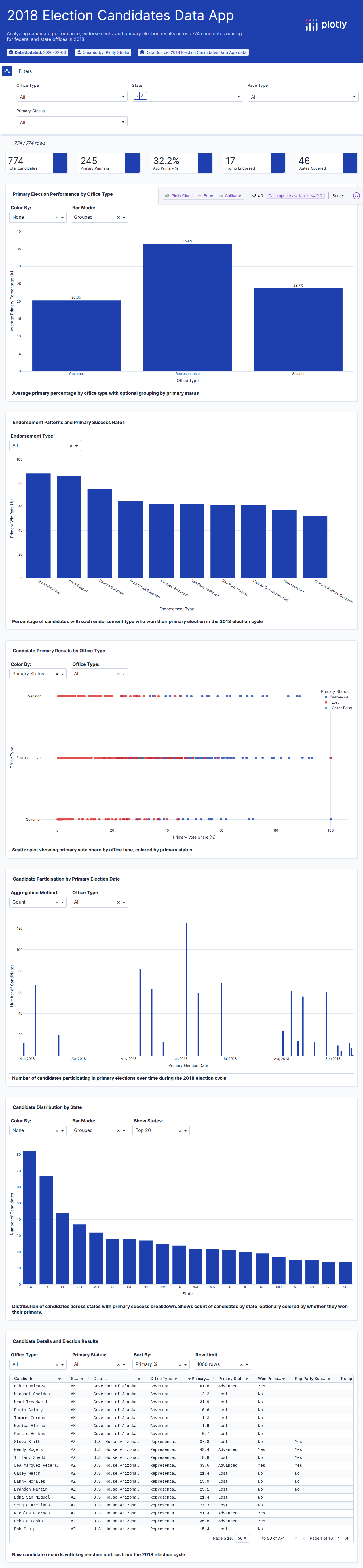
US Election Results
Attempt #160s total
US Election Results
US election results and voting data.
60s

Political Endorsements
Attempt #160s total
Political Endorsements
Political endorsement tracking data through June 30.
60s

Favorability Polls (2019)
Attempt #160s total
Favorability Polls (2019)
Politician favorability polling data from 2019.
60s

538 Election Deniers
Attempt #160s total
538 Election Deniers
FiveThirtyEight election denier candidate tracker.
60s

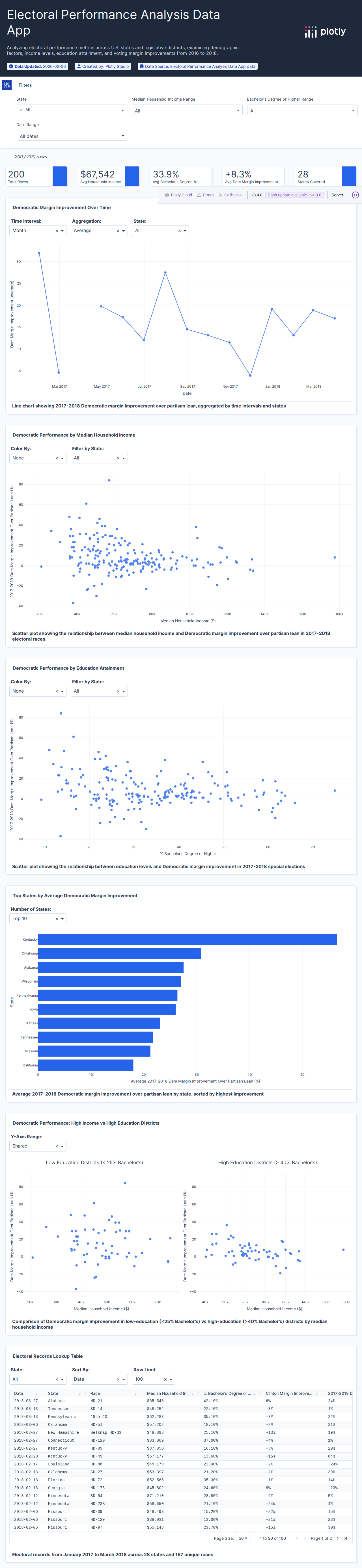
538 Partisan Lean (Districts)
Attempt #160s total
538 Partisan Lean (Districts)
FiveThirtyEight partisan lean by Congressional district.
60s

538 Partisan Lean (States)
Attempt #160s total
538 Partisan Lean (States)
FiveThirtyEight partisan lean by US state.
60s

538 State Legislative Analysis
Attempt #160s total
538 State Legislative Analysis
FiveThirtyEight state legislative district analysis.
60s

2018 Forecast Results
Attempt #160s total
2018 Forecast Results
FiveThirtyEight 2018 election forecast results.
60s

Senate Predictions History
Attempt #160s total
Senate Predictions History
Historical US Senate election prediction data.
60s

Historical Projections
Attempt #160s total
Historical Projections
Historical election projection and forecast data.
60s

Librarians by Metro Area
Attempt #160s total
Librarians by Metro Area
Librarian employment data by metropolitan statistical area.
60s

Montreal 2013 Election
Attempt #160s total
Montreal 2013 Election
Montreal 2013 election results for ternary plot.
60s

New Voter Registrations
Attempt #160s total
New Voter Registrations
New voter registration statistics by state.
60s
Obama Commutations
Attempt #160s total
Obama Commutations
Obama administration commutation and clemency data.
60s

Police Residency Data
Attempt #160s total
Police Residency Data
Police officer residency and community data.
60s

Police Use of Force
Attempt #160s total
Police Use of Force
Police use of force incident data with demographics.
60s

Pollster Accuracy Ratings
Attempt #160s total
Pollster Accuracy Ratings
FiveThirtyEight pollster accuracy ratings.
60s

Presidential Poll Averages
Attempt #160s total
Presidential Poll Averages
Presidential poll averages from 1968 to 2016.
60s

Redistricting Maps
Attempt #160s total
Redistricting Maps
Congressional redistricting alternative map proposals.
60s
Republican Candidates
Attempt #160s total
Republican Candidates
Republican presidential candidate polling data.
60s

Russia Investigation
Attempt #160s total
Russia Investigation
Russia investigation timeline and related data.
60s

Hurricane Sandy 311 Calls
Attempt #160s total
Hurricane Sandy 311 Calls
Hurricane Sandy 311 service call data by day.
60s
Special Elections
Attempt #160s total
Special Elections
US special election results and outcomes.
60s

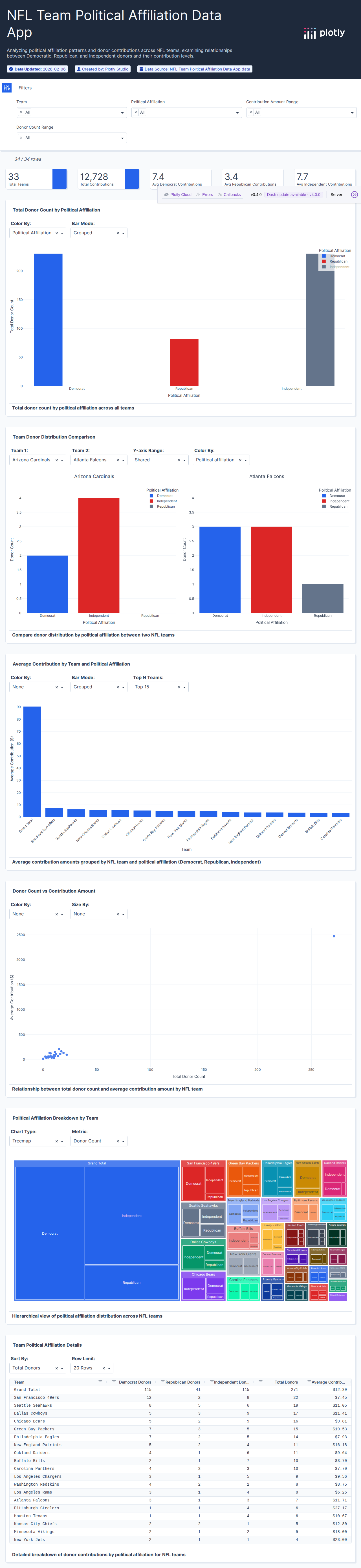
Sports Political Donations
Attempt #160s total
Sports Political Donations
Sports team owner political donation data.
60s
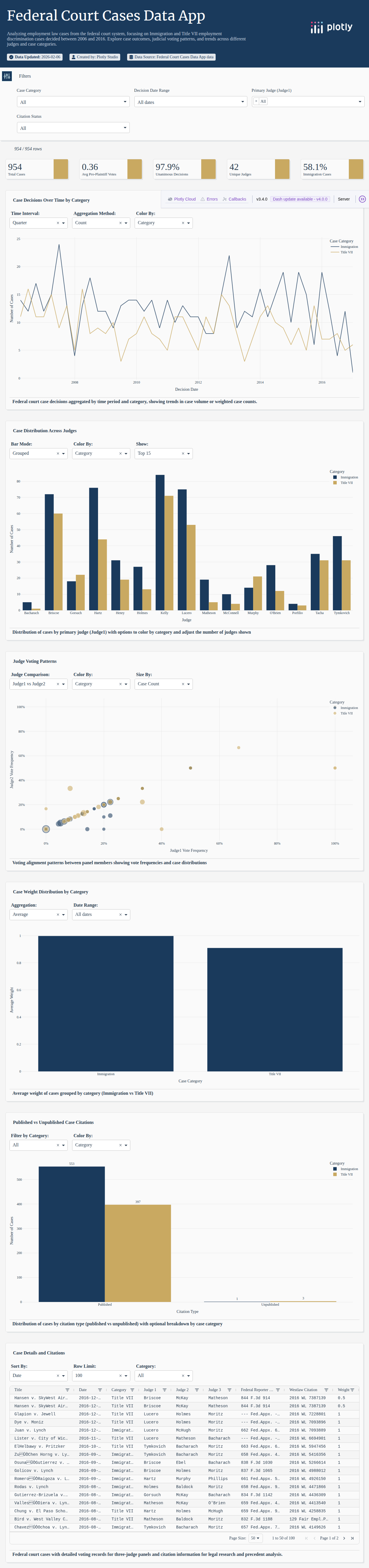
Tenth Circuit Court
Attempt #160s total
Tenth Circuit Court
US Tenth Circuit Court judicial decision data.
60s

Trump Lawsuits
Attempt #160s total
Trump Lawsuits
Trump-related lawsuit and legal case data.
60s
4 datasets

Tree Species Inventory
Attempt #1164s total
Tree Species Inventory
Tree species and forest inventory data.
164s

Food Nutrition Facts Database
Attempt #199s total
Food Nutrition Facts Database
Food nutrition facts database with detailed nutrient data.
99s
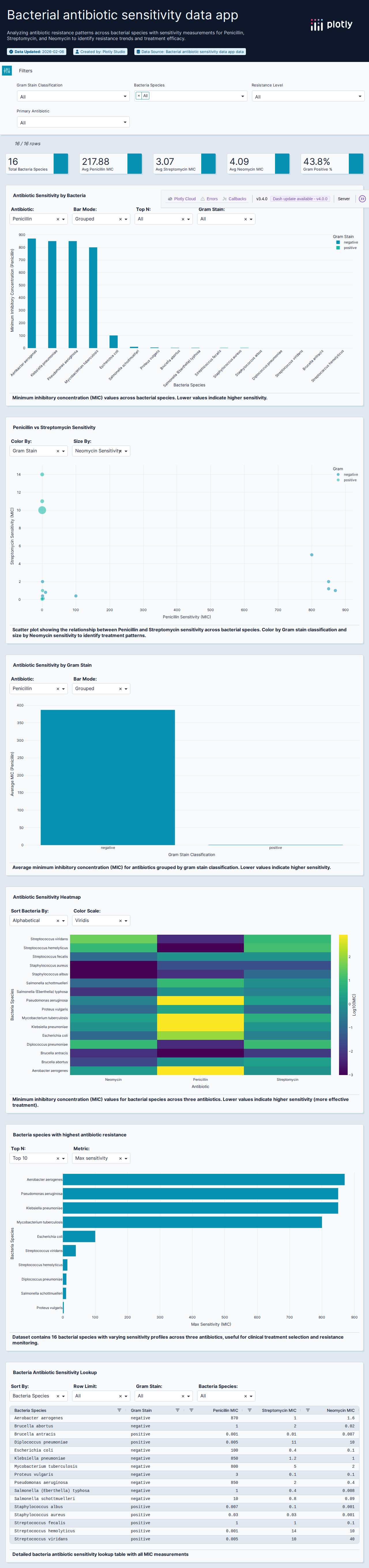
Antibiotic Effectiveness
Attempt #160s total
Antibiotic Effectiveness
Antibiotic effectiveness data across bacterial species.
60s

Goose Tracking Data
Attempt #160s total
Goose Tracking Data
Goose tracking and migration raw sensor data.
60s
9 datasets

Network Intrusion Detection
Attempt #1184s total
Network Intrusion Detection
Cybersecurity dataset for network intrusion detection analysis.
184s
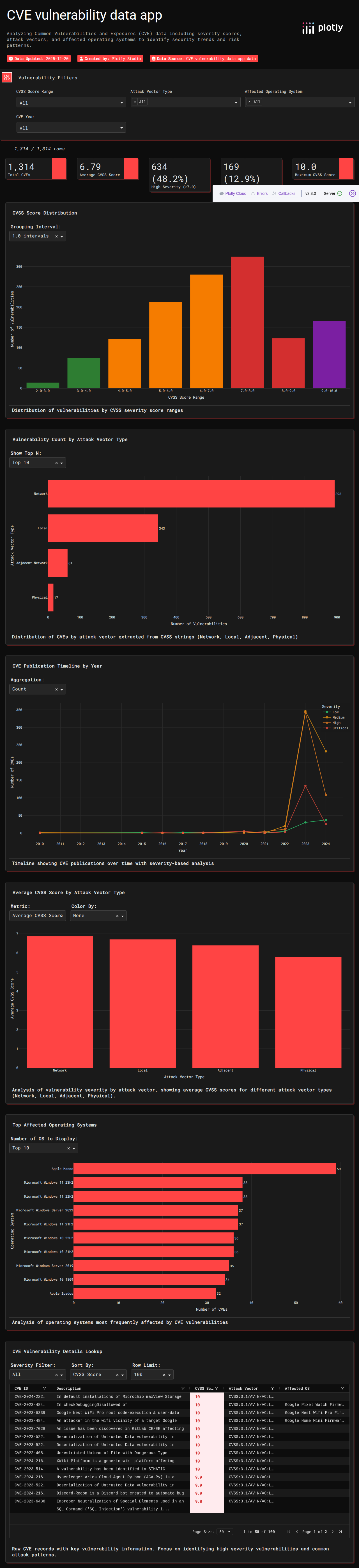
CVE Security Vulnerability Scores
Attempt #1124s total
CVE Security Vulnerability Scores
Cybersecurity vulnerability scores and severity ratings.
124s

EEG Eye State Data
Attempt #160s total
EEG Eye State Data
EEG brain signal data for eye state classification.
60s

Kaggle House Prices
Attempt #160s total
Kaggle House Prices
Kaggle house prices dataset with property features and values.
60s

Breast Cancer Wisconsin
Attempt #160s total
Breast Cancer Wisconsin
Wisconsin breast cancer diagnostic dataset.
60s

Auto Imports (1985)
Attempt #160s total
Auto Imports (1985)
Automobile imports dataset from 1985 with specifications.
60s

Normal Distribution Clusters
Attempt #160s total
Normal Distribution Clusters
Normally distributed cluster data for ML demos.
60s

P-Values Analysis
Attempt #160s total
P-Values Analysis
Statistical p-values analysis and distribution data.
60s

Training Dataset
Attempt #160s total
Training Dataset
Training dataset for machine learning classification.
60s
9 datasets

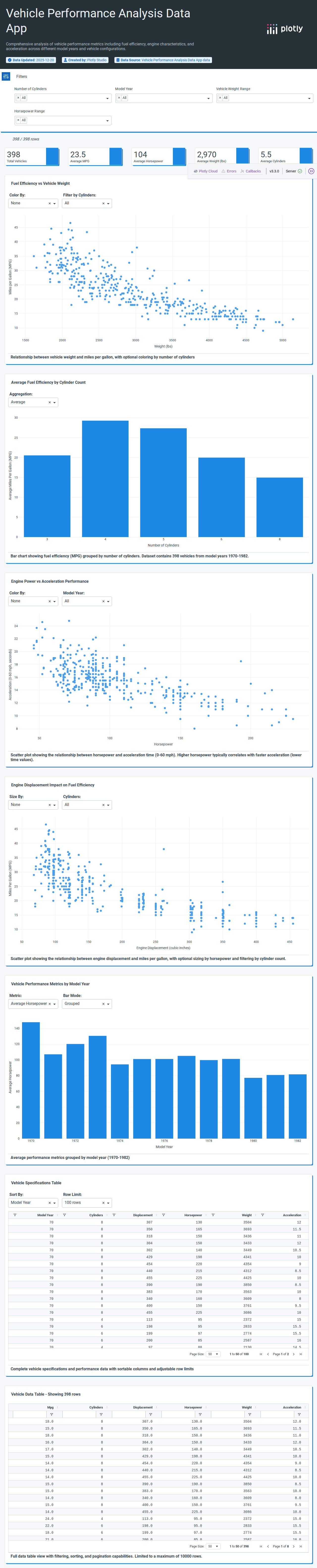
Vehicle MPG Dataset
Attempt #182s total
Vehicle MPG Dataset
Automobile fuel efficiency data comparing vehicle attributes.
82s
Automobile Fuel Economy
Attempt #178s total
Automobile Fuel Economy
Automobile fuel economy dataset with vehicle specifications.
78s
Automobile Data (1978)
Attempt #186s total
Automobile Data (1978)
1978 automobile data with engine and performance specs.
86s

Manufacturing Quality Control (10K Products)
Attempt #192s total
Manufacturing Quality Control (10K Products)
Manufacturing quality control data with 10,000 products tracking defects.
92s

Sandia Lab Sensor Data
Attempt #198s total
Sandia Lab Sensor Data
Scientific measurement data from Sandia National Laboratories sensor readings.
98s

Spectroscopy Measurements
Attempt #1146s total
Spectroscopy Measurements
Spectroscopy measurement data for chemical compound analysis.
146s

Australian Mining Survey
Attempt #1118s total
Australian Mining Survey
Australian mining geological survey batch data.
118s
IoT Sensor Readings
Attempt #168s total
IoT Sensor Readings
IoT sensor readings tracking environmental conditions over time.
68s

Motor Trend Car Road Tests
Attempt #184s total
Motor Trend Car Road Tests
Motor Trend car road test data with performance metrics.
84s
5 datasets

Mobile App Usage Analytics
Attempt #1132s total
Mobile App Usage Analytics
Mobile app usage statistics with engagement metrics.
132s

Cloud Services Usage
Attempt #180s total
Cloud Services Usage
Cloud computing service usage and cost metrics.
80s
Online News Popularity
Attempt #160s total
Online News Popularity
Online news article popularity prediction dataset.
60s

Cable TV Weekly Ratings
Attempt #160s total
Cable TV Weekly Ratings
Weekly cable TV ratings and viewership data.
60s

Online Weekly Metrics
Attempt #160s total
Online Weekly Metrics
Weekly online engagement and traffic metrics.
60s
5 datasets

English-French Translation Pairs
Attempt #198s total
English-French Translation Pairs
English-French translation pairs for language processing.
98s

Hip Hop Lyrics (Genius)
Attempt #160s total
Hip Hop Lyrics (Genius)
Hip hop song lyrics and metadata from Genius.
60s

Pulitzer Circulation Data
Attempt #160s total
Pulitzer Circulation Data
Pulitzer Prize winning newspaper circulation data.
60s

Twitter/X Posts
Attempt #160s total
Twitter/X Posts
Twitter/X social media post analysis dataset.
60s

Word Frequency Data
Attempt #160s total
Word Frequency Data
Word frequency and text analysis dataset.
60s
38 datasets

Montreal Airbnb Neighborhoods
Attempt #178s total
Montreal Airbnb Neighborhoods
Montreal Airbnb listing data grouped by neighborhood.
78s

Montreal Airbnb Listings
Attempt #1140s total
Montreal Airbnb Listings
Complete Montreal Airbnb listings with prices and amenities.
140s

Montreal Airbnb Reviews
Attempt #1110s total
Montreal Airbnb Reviews
Guest reviews for Montreal Airbnb properties and hosts.
110s

Austin Animal Shelter Outcomes
Attempt #1109s total
Austin Animal Shelter Outcomes
Austin animal shelter intake and outcome records.
109s
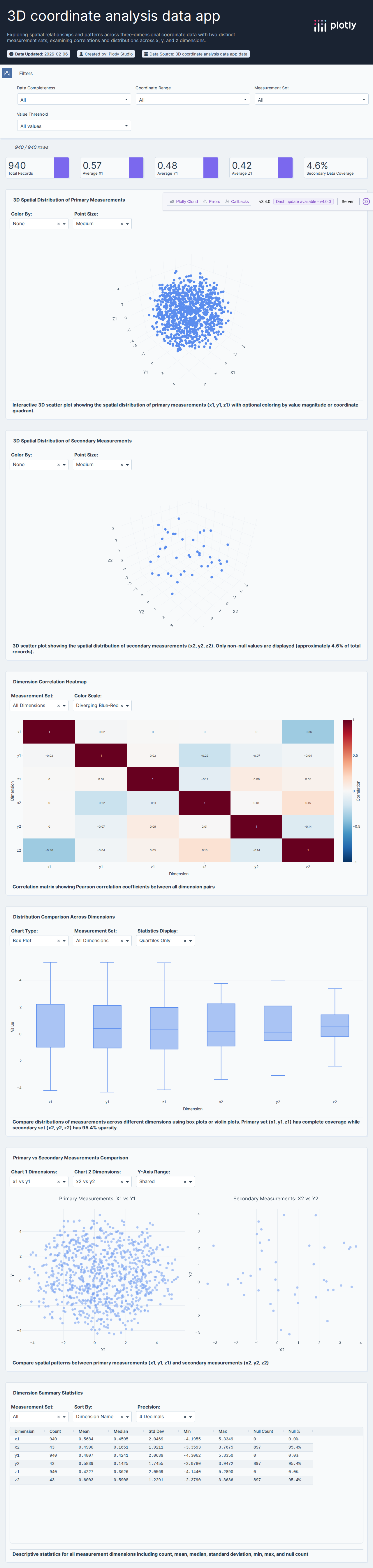
3D Line Plot
Attempt #160s total
3D Line Plot
3D line plot data for spatial visualization.
60s
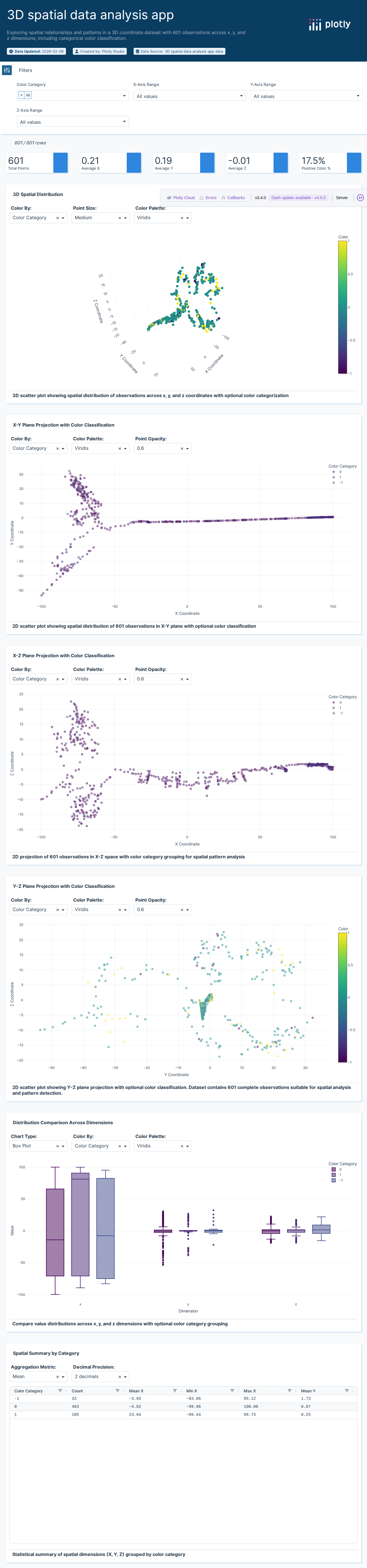
3D Scatter Plot
Attempt #160s total
3D Scatter Plot
3D scatter plot data with x, y, z coordinates.
60s

Star Wars Characters
Attempt #160s total
Star Wars Characters
Star Wars character data with physical attributes.
60s

3D Line Plot Data
Attempt #160s total
3D Line Plot Data
3D line plot coordinate data for visualization.
60s

Comprehensive Dataset
Attempt #160s total
Comprehensive Dataset
Comprehensive multi-variable dataset for analysis.
60s

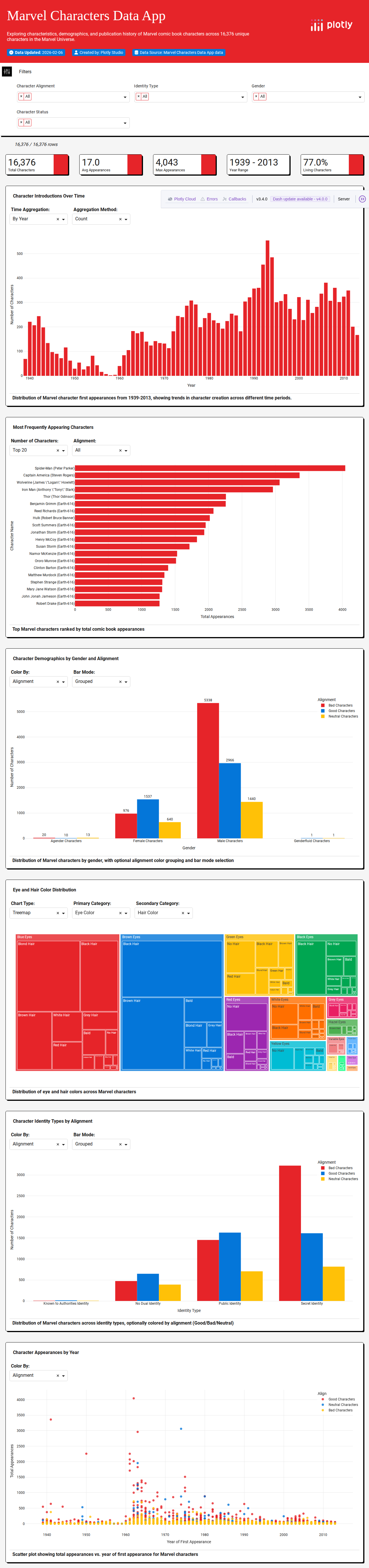
Marvel Avengers Data
Attempt #160s total
Marvel Avengers Data
Marvel Avengers character data and comic appearances.
60s

Bar Chart Excel Data
Attempt #160s total
Bar Chart Excel Data
Sample data for bar chart visualization tutorials.
60s
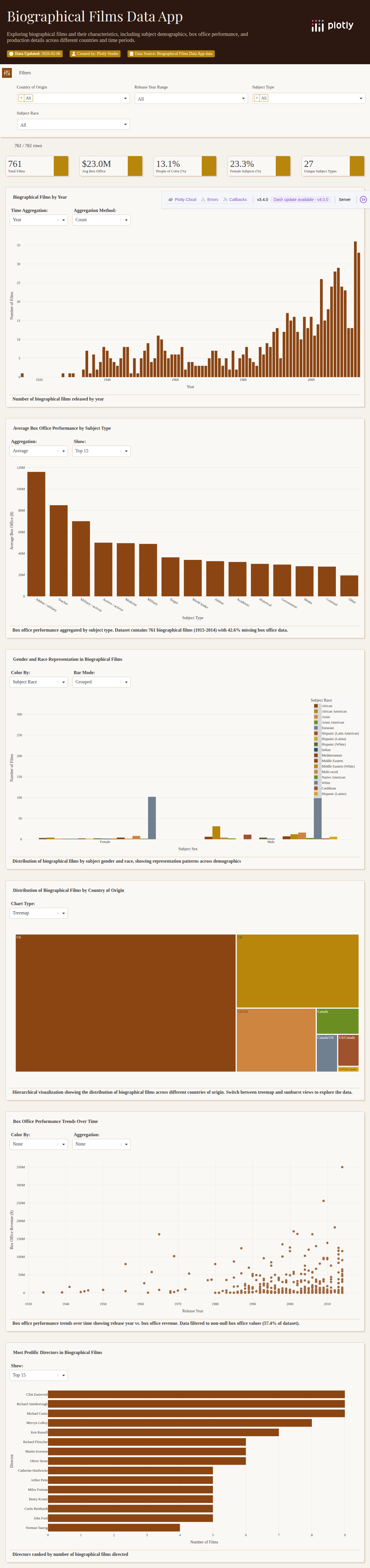
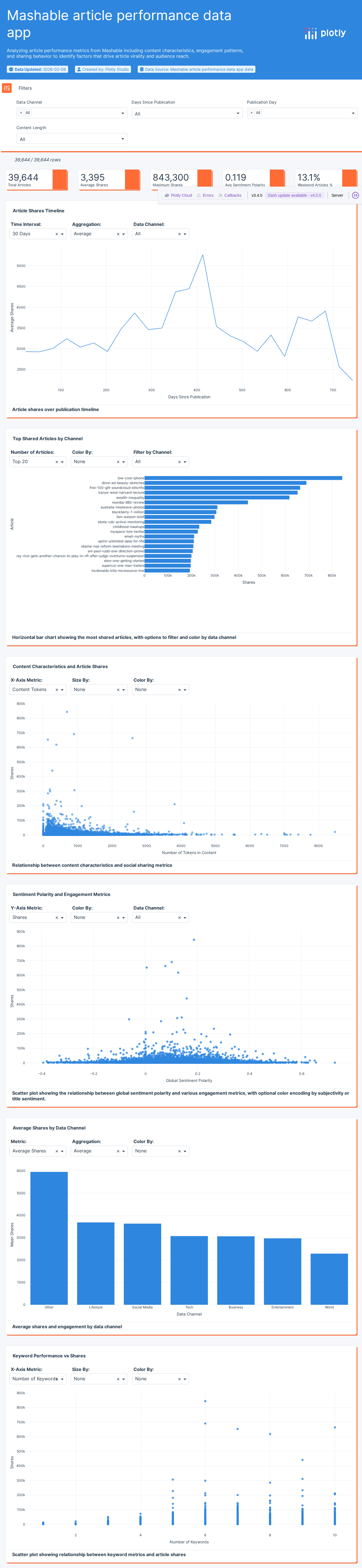
Biographical Films
Attempt #160s total
Biographical Films
Biographical film data with subjects and box office info.
60s

Bubble Chart Tutorial
Attempt #160s total
Bubble Chart Tutorial
Tutorial data for bubble chart visualizations.
60s

Halloween Candy Rankings
Attempt #160s total
Halloween Candy Rankings
Halloween candy preference and ranking data.
60s

Classic Rock Playlist
Attempt #160s total
Classic Rock Playlist
Classic rock radio station playlist and play count data.
60s

3D Cone Plot
Attempt #160s total
3D Cone Plot
3D cone plot vector field visualization data.
60s

Daily Show Guests
Attempt #160s total
Daily Show Guests
The Daily Show guest appearance data by year.
60s

DC Comics Characters
Attempt #160s total
DC Comics Characters
DC Comics character data from Wikipedia/Wikia.
60s

Show Elements by Episode
Attempt #160s total
Show Elements by Episode
TV show elements appearing by episode data.
60s

Fandango Movie Ratings
Attempt #160s total
Fandango Movie Ratings
Fandango movie rating and review data.
60s

Simple Histogram
Attempt #160s total

IMDB Top 1000 Movies
Attempt #160s total
IMDB Top 1000 Movies
IMDB top 1000 movies with ratings and metadata.
60s

Inset Plot Data
Attempt #160s total
Inset Plot Data
Data for inset plot visualization demonstrations.
60s

Love Actually Screen Time
Attempt #160s total
Love Actually Screen Time
Love Actually movie character screen time data.
60s
Marvel Characters (Wikia)
Attempt #160s total
Marvel Characters (Wikia)
Marvel Comics character data from Wikia.
60s

Movies Database
Attempt #160s total
Movies Database
Movie database with ratings, genres, and box office data.
60s

Multiple Y-Axis Data
Attempt #160s total
Multiple Y-Axis Data
Multi-variable data for multiple Y-axis charts.
60s

Parallel Coordinates
Attempt #160s total
Parallel Coordinates
Parallel coordinates visualization dataset.
60s

Polar Plot Data
Attempt #160s total
Polar Plot Data
Polar coordinate plot demonstration data.
60s

Ratings Dataset
Attempt #160s total
Ratings Dataset
Product or content rating and review data.
60s

TV Show Data
Attempt #160s total

Simple Features
Attempt #160s total
Simple Features
Simple feature dataset for data science demos.
60s

Spotify Track Data
Attempt #160s total
Spotify Track Data
Spotify music track features and popularity data.
60s

Streamtube Basic
Attempt #160s total
Streamtube Basic
Basic streamtube 3D flow visualization data.
60s

Styled Line Chart
Attempt #160s total
Styled Line Chart
Styled line chart demonstration data.
60s

Subplot Data
Attempt #160s total
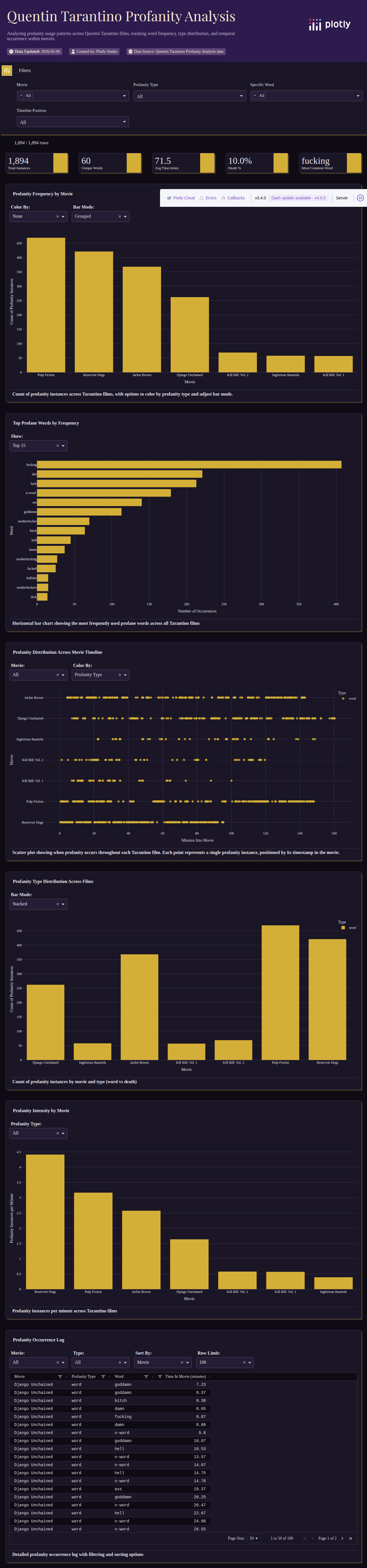
Tarantino Film Data
Attempt #160s total
Tarantino Film Data
Quentin Tarantino film profanity and violence data.
60s

Violin Plot Data
Attempt #160s total
Violin Plot Data
Data formatted for violin plot visualizations.
60s
16 datasets

Hobbs-Pearson Clinical Trials
Attempt #1110s total
Hobbs-Pearson Clinical Trials
Clinical trial results from Hobbs-Pearson medical studies.
110s
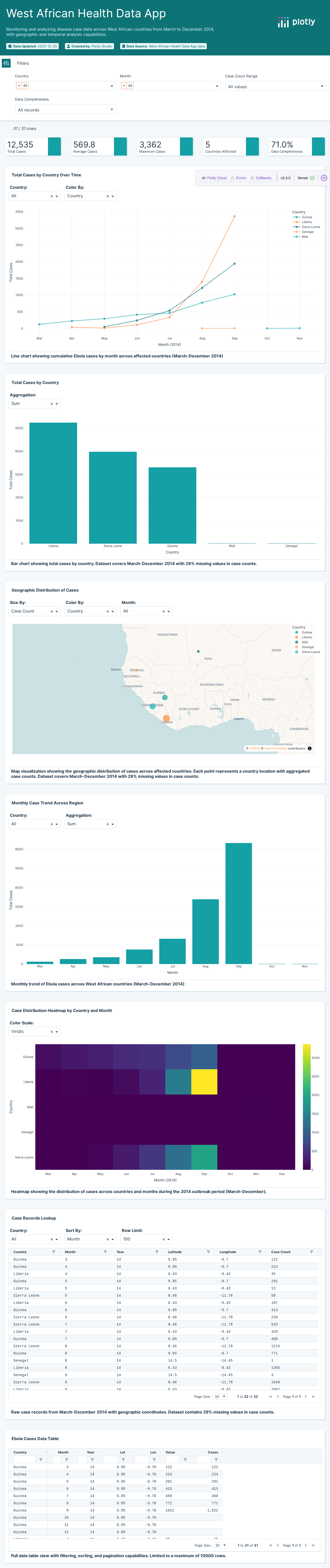
Ebola Outbreak (2014)
Attempt #194s total
Ebola Outbreak (2014)
West Africa Ebola outbreak tracking data from 2014.
94s

NHS Hospital Statistics
Attempt #1105s total
NHS Hospital Statistics
UK National Health Service hospital statistics and metrics.
105s
Rituximab Treatment Data
Attempt #184s total
Rituximab Treatment Data
Clinical trial data tracking patient responses to rituximab treatment.
84s

Primary Biliary Cholangitis
Attempt #189s total
Primary Biliary Cholangitis
Primary biliary cholangitis patient survival and event data.
89s

AIDS Clinical Data
Attempt #160s total
AIDS Clinical Data
HIV/AIDS clinical trial and epidemiological data.
60s

US Tuberculosis Cases
Attempt #160s total
US Tuberculosis Cases
Tuberculosis case counts across US states.
60s

BUPA Liver Disorders
Attempt #160s total
BUPA Liver Disorders
BUPA liver disorder diagnostic dataset.
60s

Diabetes Video Data
Attempt #160s total
Diabetes Video Data
Diabetes patient video consultation and health data.
60s

Drug Use by Age
Attempt #160s total
Drug Use by Age
Drug use prevalence statistics by age group.
60s
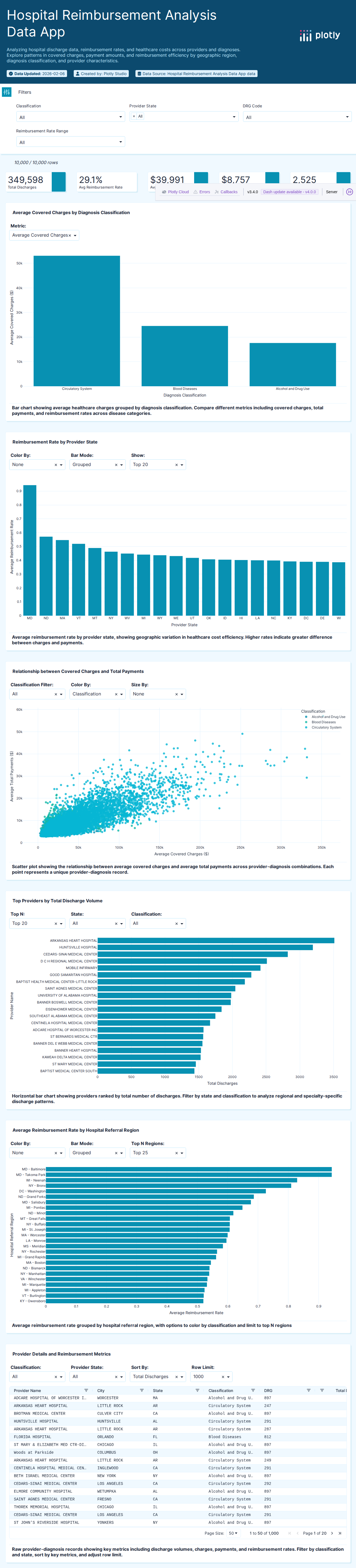
Medicare Data
Attempt #160s total
Medicare Data
Medicare healthcare program spending and enrollment data.
60s

Medicare Cost Data
Attempt #160s total
Medicare Cost Data
Medicare cost data by provider and procedure.
60s

Metro ICU Beds
Attempt #160s total
Metro ICU Beds
Metropolitan area ICU bed capacity data.
60s

Cervical Cancer Risk Factors
Attempt #160s total
Cervical Cancer Risk Factors
Cervical cancer risk factor medical dataset.
60s

COVID-19 Deaths Time Series
Attempt #160s total
COVID-19 Deaths Time Series
COVID-19 death time series data archived March 2025.
60s

Blood Transfusion Data
Attempt #160s total
Blood Transfusion Data
Blood transfusion service donation dataset.
60s
39 datasets

Top 1000 US Cities
Attempt #180s total
Top 1000 US Cities
Top 1000 US cities population data across multiple years.
80s

US County Labor Statistics
Attempt #192s total
US County Labor Statistics
US county-level labor statistics and unemployment data.
92s

Alcohol Consumption by Country (2010)
Attempt #160s total
Alcohol Consumption by Country (2010)
Global alcohol consumption statistics by country for 2010.
60s

Social Vulnerability Index (2022)
Attempt #1113s total
Social Vulnerability Index (2022)
CDC Social Vulnerability Index by US county for 2022.
113s

World Tourism Statistics
Attempt #182s total
World Tourism Statistics
World Bank international tourism statistics by country.
82s

US Cities Population (2014)
Attempt #198s total
US Cities Population (2014)
US cities population and geographic data for 2014.
98s

European Unemployment (OECD)
Attempt #186s total
European Unemployment (OECD)
European unemployment statistics from OECD sources.
86s

Canadian Immigration Statistics
Attempt #1100s total
Canadian Immigration Statistics
Canadian immigration and relocation statistics.
100s

World Development Indicators
Attempt #190s total
World Development Indicators
World development indicators by country in wide format.
90s

Population Density by District
Attempt #1106s total
Population Density by District
Population density data by geographic district.
106s

Metro Area Unemployment (2019-2024)
Attempt #1106s total
Metro Area Unemployment (2019-2024)
US metro area unemployment rates from 2019 to 2024.
106s

Zodiac Sign Data
Attempt #184s total
Zodiac Sign Data
Astrological data with zodiac sign characteristics.
84s

US Midwest Demographics
Attempt #160s total
US Midwest Demographics
US Midwest region demographic and socioeconomic data.
60s

US Births (2000-2014)
Attempt #160s total
US Births (2000-2014)
US birth data from Social Security Administration 2000-2014.
60s
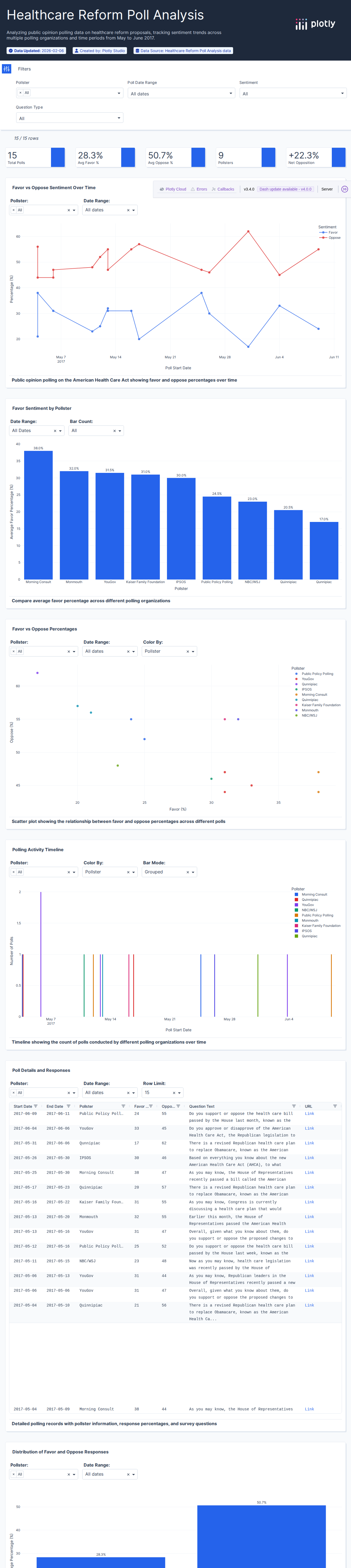
AHCA Polling Data
Attempt #160s total
AHCA Polling Data
American Health Care Act public opinion polling data.
60s

Bad Drivers by State
Attempt #160s total
Bad Drivers by State
Bad driving statistics by US state.
60s
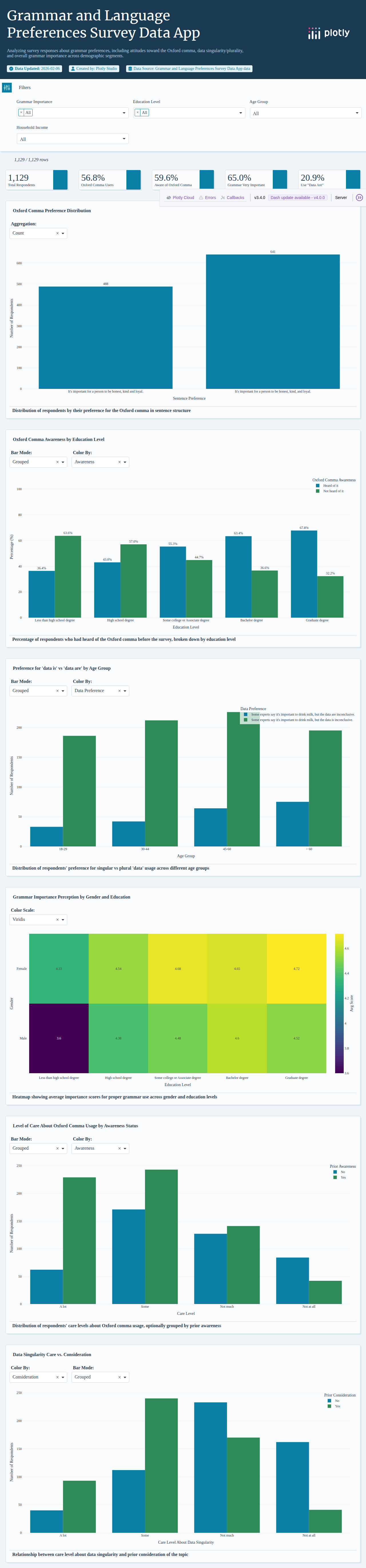
Oxford Comma Survey
Attempt #160s total
Oxford Comma Survey
Oxford comma usage survey results.
60s

Cousin Marriage Statistics
Attempt #160s total
Cousin Marriage Statistics
Global consanguinity and cousin marriage statistics.
60s

Divorce Rate Statistics
Attempt #160s total
Divorce Rate Statistics
Divorce rate statistics and demographic factors.
60s

Global Alcohol Consumption
Attempt #160s total
Global Alcohol Consumption
Global alcohol consumption data by country and type.
60s
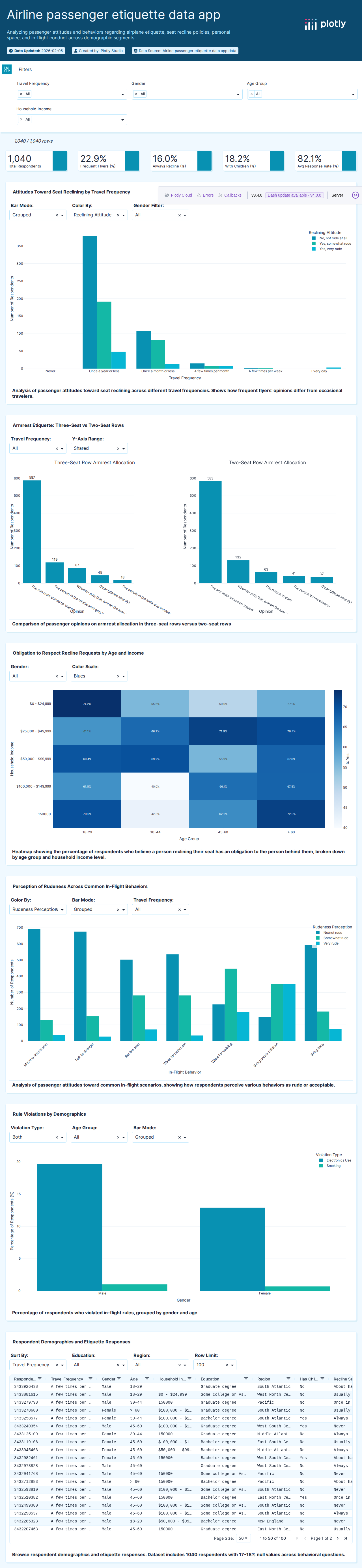
Flying Etiquette Survey
Attempt #160s total
Flying Etiquette Survey
Flying etiquette survey results and preferences.
60s

Food World Cup
Attempt #160s total
Food World Cup
Global food preference tournament survey data.
60s
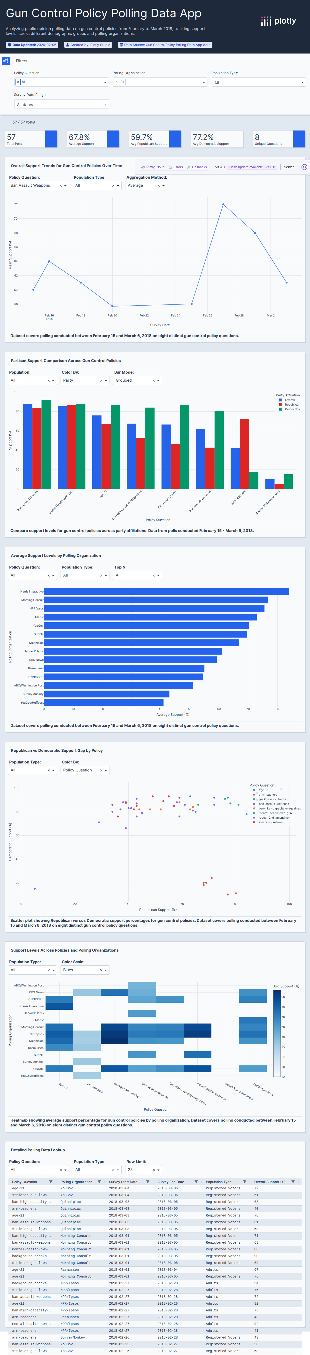
Gun Control Polls
Attempt #160s total
Gun Control Polls
Gun control public opinion polling data.
60s

Hate Crime Statistics
Attempt #160s total
Hate Crime Statistics
Hate crime statistics by US state and demographics.
60s

Job Automation Probability
Attempt #160s total
Job Automation Probability
Job automation probability by occupation.
60s

Masculinity Survey
Attempt #160s total
Masculinity Survey
Survey data on masculinity and gender attitudes.
60s
Metro Area Grades
Attempt #160s total
Metro Area Grades
Metropolitan area economic and livability grades.
60s

Minority-Majority Shift
Attempt #160s total
Minority-Majority Shift
US minority-majority demographic shift data.
60s
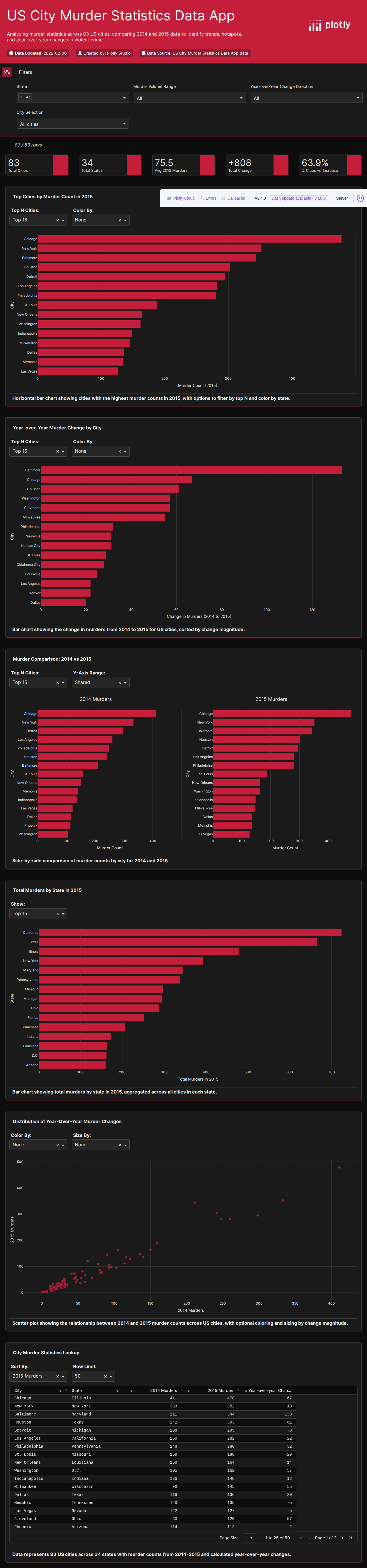
Murder Rates (2015)
Attempt #160s total
Murder Rates (2015)
US city murder rate data for 2015.
60s
Non-Voters Survey
Attempt #160s total
Non-Voters Survey
Survey data on non-voters and voting barriers.
60s

OkCupid Compatibility
Attempt #160s total
OkCupid Compatibility
OkCupid dating compatibility data by religion.
60s

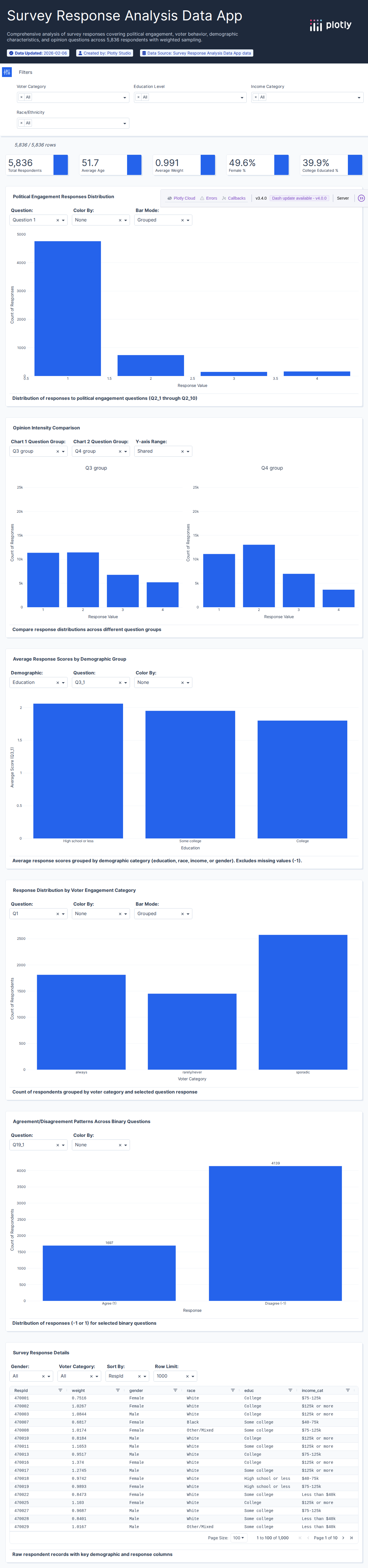
Survey Raw Responses
Attempt #160s total
Survey Raw Responses
Survey raw response data for analysis.
60s

Religion Survey Results
Attempt #160s total
Religion Survey Results
Religious affiliation and practice survey data.
60s

Sleeping Habits Survey
Attempt #160s total
Sleeping Habits Survey
Survey data on sleeping habits and preferences.
60s

State Population Projections
Attempt #160s total
State Population Projections
US state population projections by demographics.
60s

Steak Risk Survey
Attempt #160s total
Steak Risk Survey
Steak doneness preference and risk tolerance survey.
60s

Thanksgiving Survey (2015)
Attempt #160s total
Thanksgiving Survey (2015)
Thanksgiving meal preferences and traditions survey 2015.
60s

Urbanization Index (2022)
Attempt #160s total
Urbanization Index (2022)
Urbanization index data by region for 2022.
60s
Women in Leadership
Attempt #160s total
Women in Leadership
Women in leadership and representation statistics.
60s
23 datasets

MLS Soccer Statistics (2025)
Attempt #1138s total
MLS Soccer Statistics (2025)
Major League Soccer team and player statistics.
138s

Racing Game Performance
Attempt #1108s total
Racing Game Performance
Racing game performance data with lap times and rankings.
108s

Baseball Pitch Spin Rates
Attempt #178s total
Baseball Pitch Spin Rates
Baseball pitch spin rate data for pitcher performance analysis.
78s

Tour de France Stage Data
Attempt #198s total
Tour de France Stage Data
Stage-by-stage race data from Tour de France cycling events.
98s

Tour de France Winners
Attempt #186s total
Tour de France Winners
Historical Tour de France winners with race statistics.
86s

NFL Fandom (Google Trends)
Attempt #160s total
NFL Fandom (Google Trends)
NFL team fandom data from Google Trends analysis.
60s
NFL Fandom (SurveyMonkey)
Attempt #160s total
NFL Fandom (SurveyMonkey)
NFL team fandom survey data from SurveyMonkey.
60s

NBA All-Star Player Talent
Attempt #160s total
NBA All-Star Player Talent
NBA All-Star player talent ratings and statistics.
60s

NBA All-Star Team Talent
Attempt #160s total
NBA All-Star Team Talent
NBA All-Star team aggregate talent metrics.
60s

Draymond Green Analytics
Attempt #160s total
Draymond Green Analytics
Draymond Green basketball performance analytics.
60s

FIFA Elo Ratings
Attempt #160s total
FIFA Elo Ratings
FIFA World Cup Elo ratings and Blatter era analysis.
60s

FIFA World Cup Audience
Attempt #160s total
FIFA World Cup Audience
FIFA World Cup TV audience data by country.
60s

College Fight Songs
Attempt #160s total
College Fight Songs
College fight song data with tempo and lyrics analysis.
60s

Baseball Foul Balls
Attempt #160s total
Baseball Foul Balls
Baseball foul ball injury and incident data.
60s

538 NCAA Tournament Model
Attempt #160s total
538 NCAA Tournament Model
FiveThirtyEight historical NCAA tournament predictions.
60s

NCAA Women's Basketball
Attempt #160s total
NCAA Women's Basketball
NCAA women's basketball tournament historical results.
60s

NFL Suspensions
Attempt #160s total
NFL Suspensions
NFL player suspension history and details.
60s

NHL Draft (2013)
Attempt #160s total
NHL Draft (2013)
NHL 2013 draft pick data and player analysis.
60s

Basketball Win Shares
Attempt #160s total
Basketball Win Shares
Basketball quasi win shares advanced analytics.
60s

Tennis Serve Times
Attempt #160s total
Tennis Serve Times
Tennis serve time and performance data.
60s

Team Draft Categories
Attempt #160s total
Team Draft Categories
Team draft picking and categorization data.
60s

Sports Transfers
Attempt #160s total
Sports Transfers
Sports player transfer data with fees and teams.
60s

Undefeated Seasons
Attempt #160s total
Undefeated Seasons
Sports team undefeated seasons and streaks data.
60s
7 datasets

Car Sharing Usage Data
Attempt #196s total
Car Sharing Usage Data
Car sharing service usage data with trip patterns.
96s

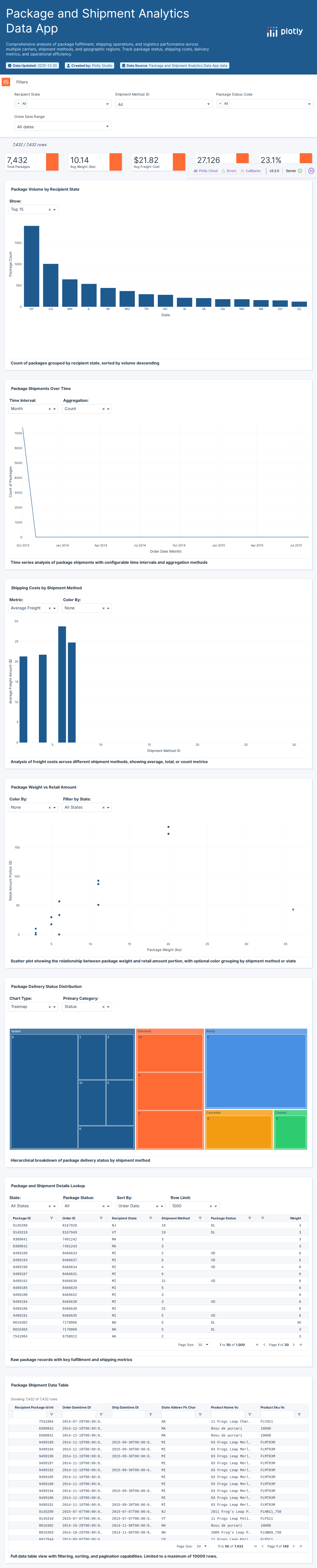
Supply Chain Logistics
Attempt #178s total
Supply Chain Logistics
Supply chain logistics data tracking inventory and shipping.
78s

Birmingham Parking
Attempt #160s total
Birmingham Parking
Birmingham city parking occupancy and availability data.
60s

Airline Safety Records
Attempt #160s total
Airline Safety Records
Airline safety records with incident and fatality data.
60s
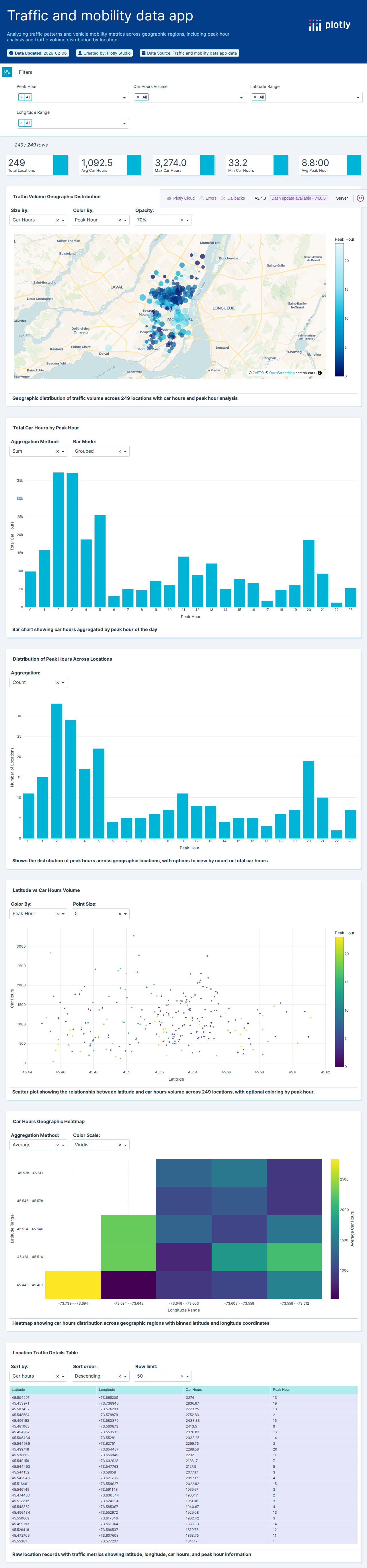
Car Share Trip Data
Attempt #160s total
Car Share Trip Data
Car sharing trip data with routes and timestamps.
60s

Flight Data
Attempt #160s total
Flight Data
Commercial flight data with routes and delays.
60s
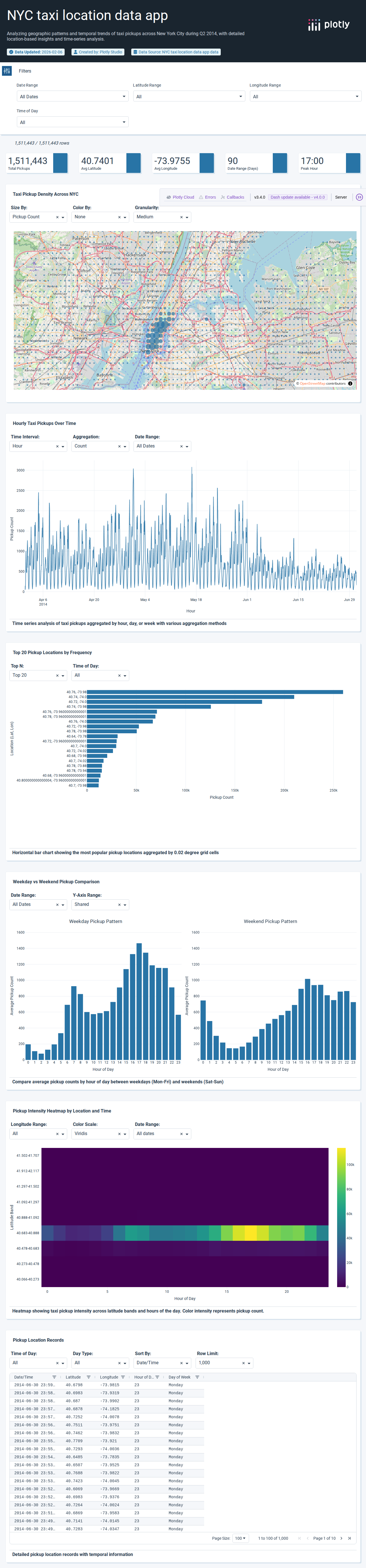
Uber Rides Data
Attempt #160s total
Uber Rides Data
Uber ride data with pickup locations and times.
60s
1 dataset

Daily Demand Forecasting
Attempt #160s total
Daily Demand Forecasting
Daily order demand forecasting for supply chain planning.
60s