KnowWhen
Guess Less. Connect More.
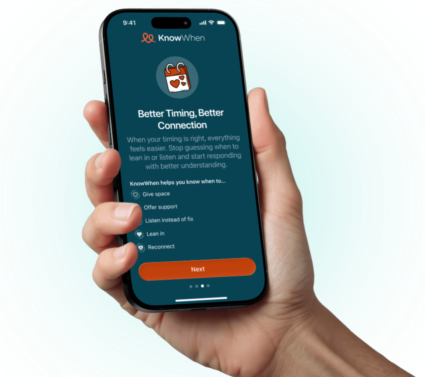
KnowWhen is a high-empathy MVP crafted to help male partners navigate the rhythms of their relationship. By providing a clear roadmap of their partner’s cycle, we’ve replaced guesswork with understanding.
Project Scope:
UX Design
UI Design
Interaction Design
Product Design
Branding
The Brief
Even with the best intentions, timing can make or break a connection. KnowWhen was built to remove the friction of “guessing” when to lean in or give space, providing men with a supportive, private tool to better understand their partner’s cycle and foster deeper intimacy.

Our Work
Lean MVP Strategy
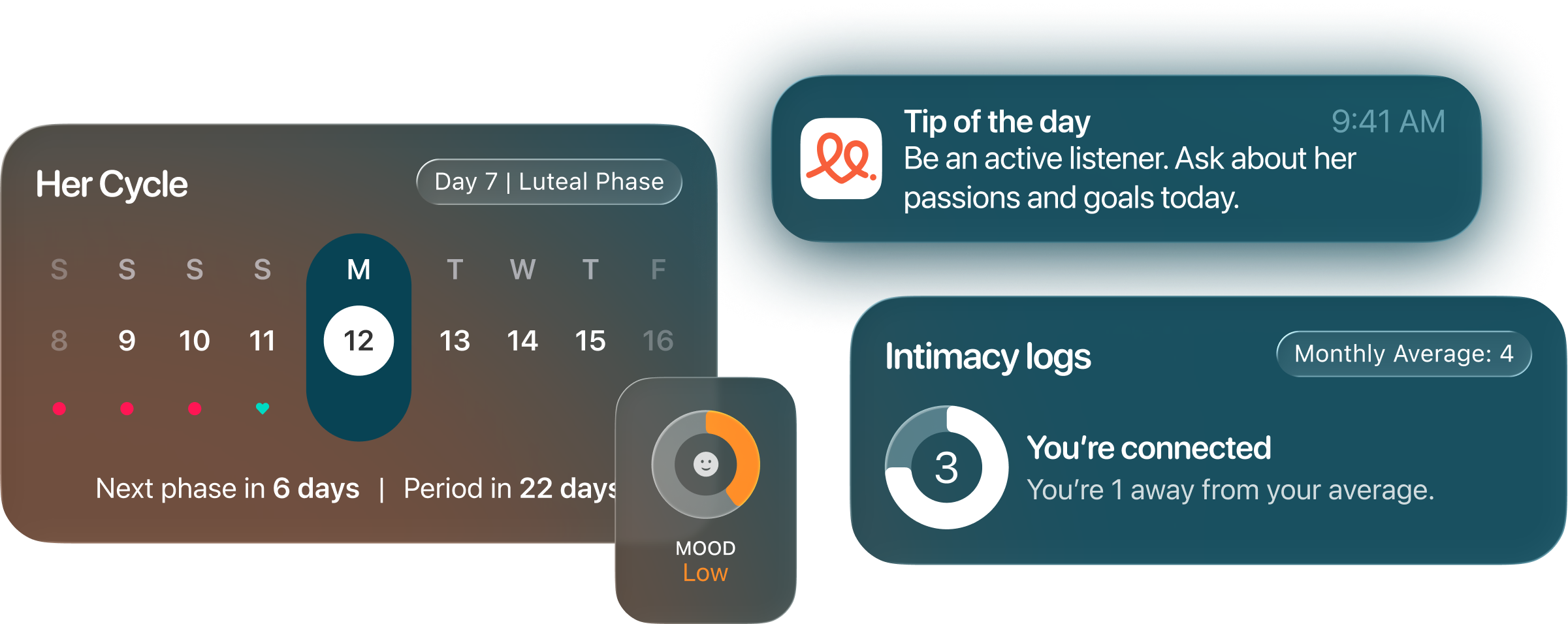
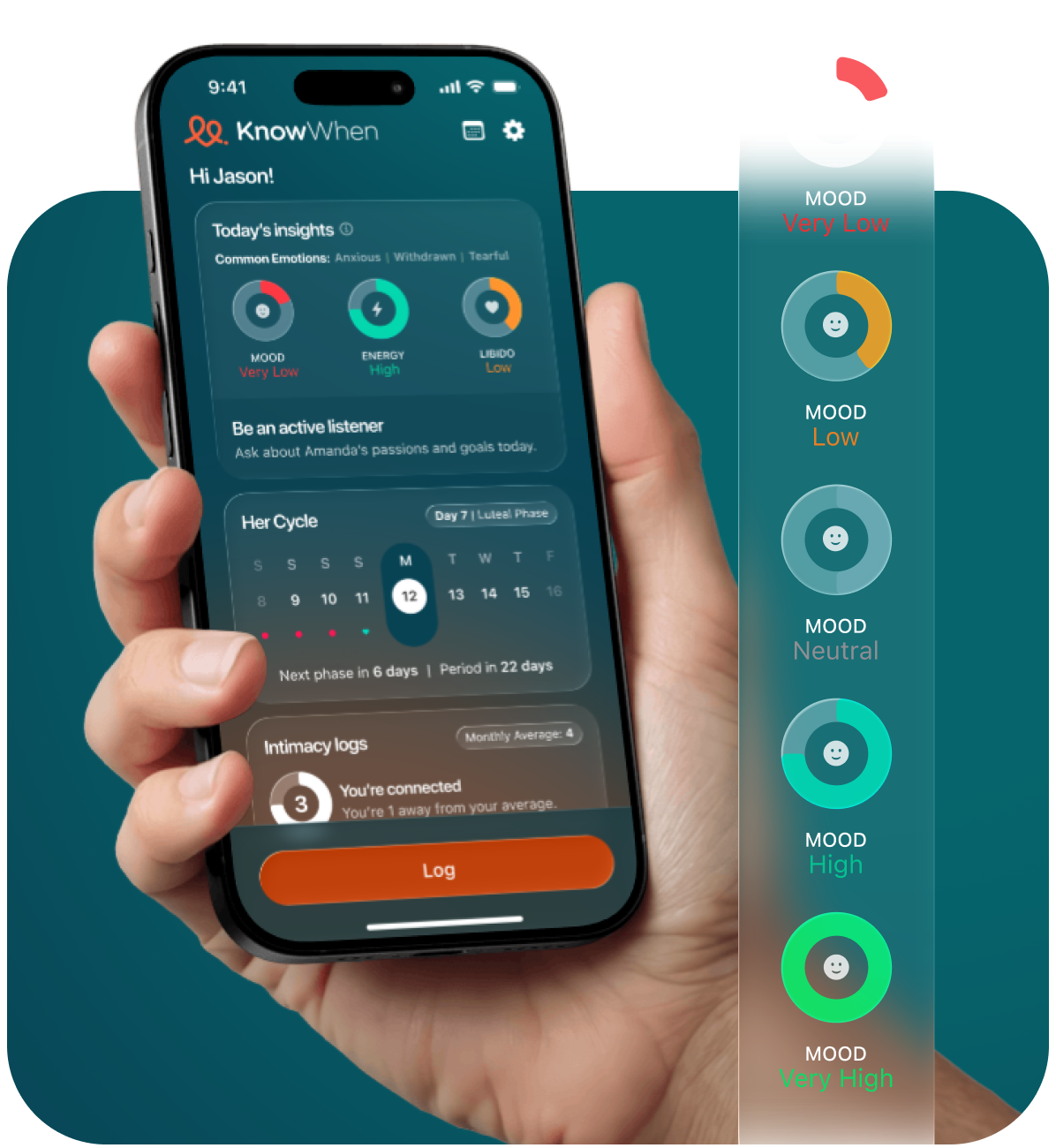
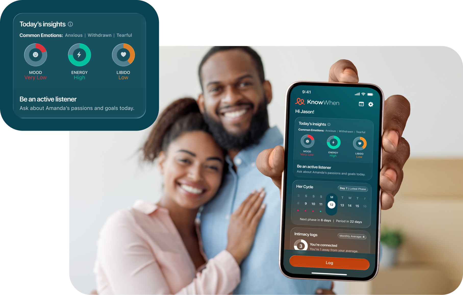
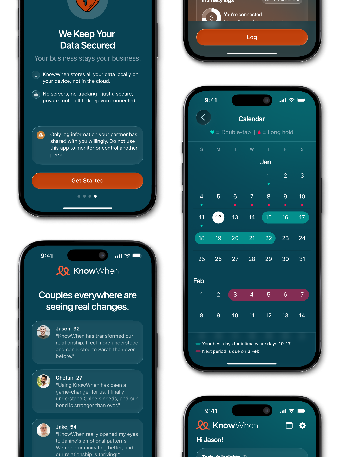
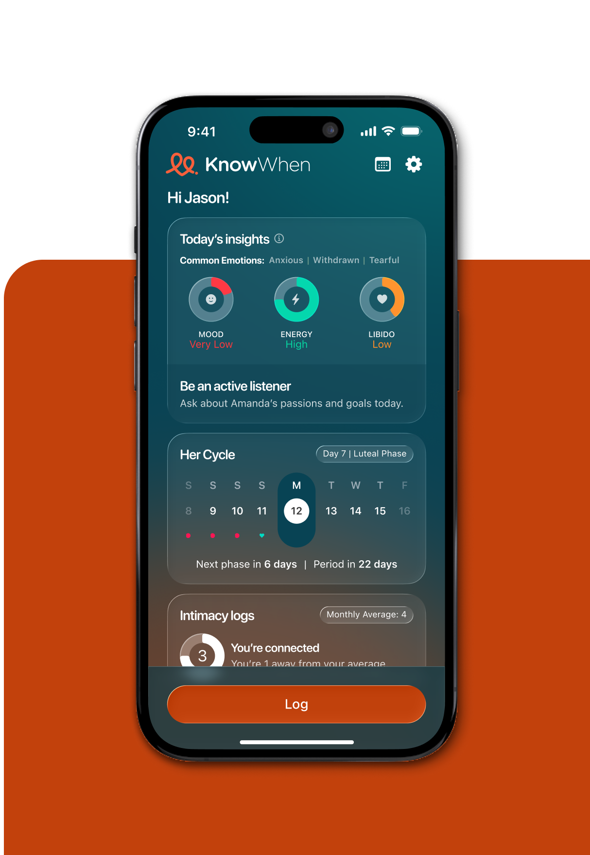
To ensure a fast and effective launch, we focused on high-impact simplicity. We prioritized a lean design-to-dev pipeline, consolidating complex tracking into an intuitive dashboard that delivers immediate value without cognitive load.
Invisible Interactions
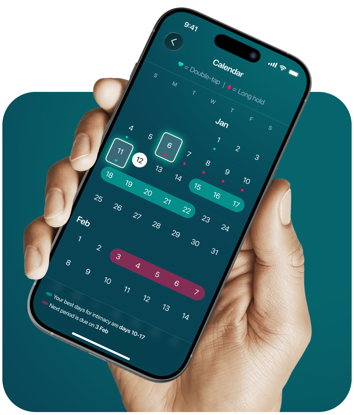
We solved the challenge of dual-purpose logging by utilizing native gesture patterns. Instead of cluttered menus, we implemented a double-tap for intimacy and a long-hold for period logging. This keeps the calendar interface clean and discreet while maintaining a fast, frictionless user experience.
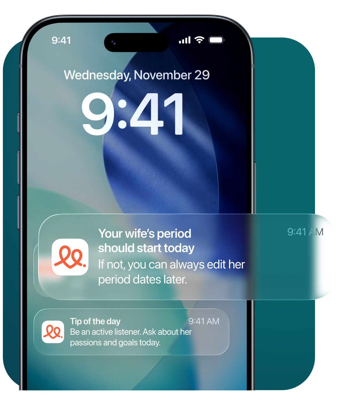
Utility-First Notifications
While the app serves as a tracking hub, its true power lies in its proactive nature. The design centers on supportive notifications—daily tips and reminders that act as a “cheat sheet” for empathy, ensuring the user has the right information at the exact moment it’s needed most.
Branding
A Grounded Aesthetic
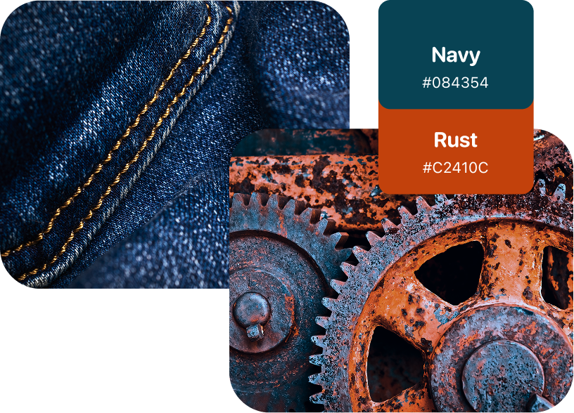
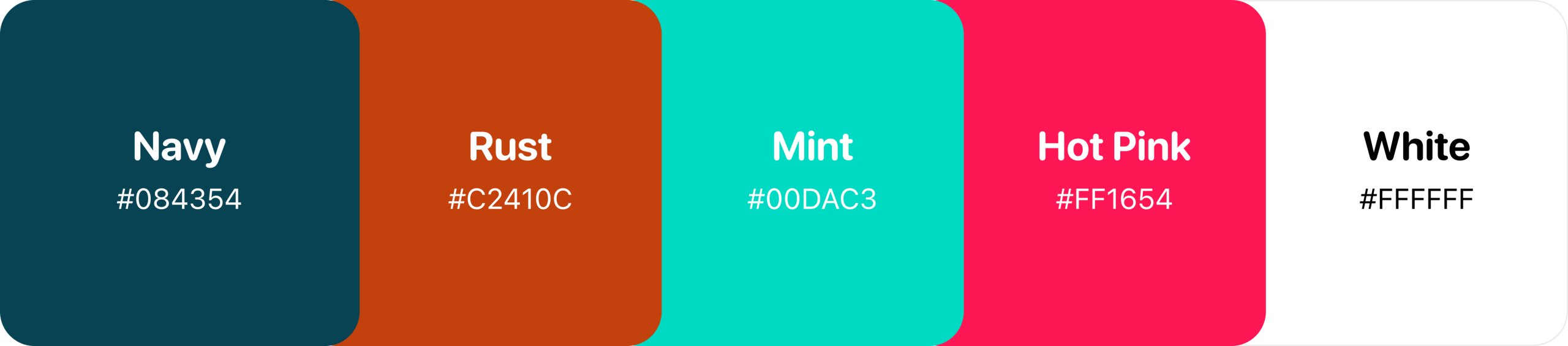
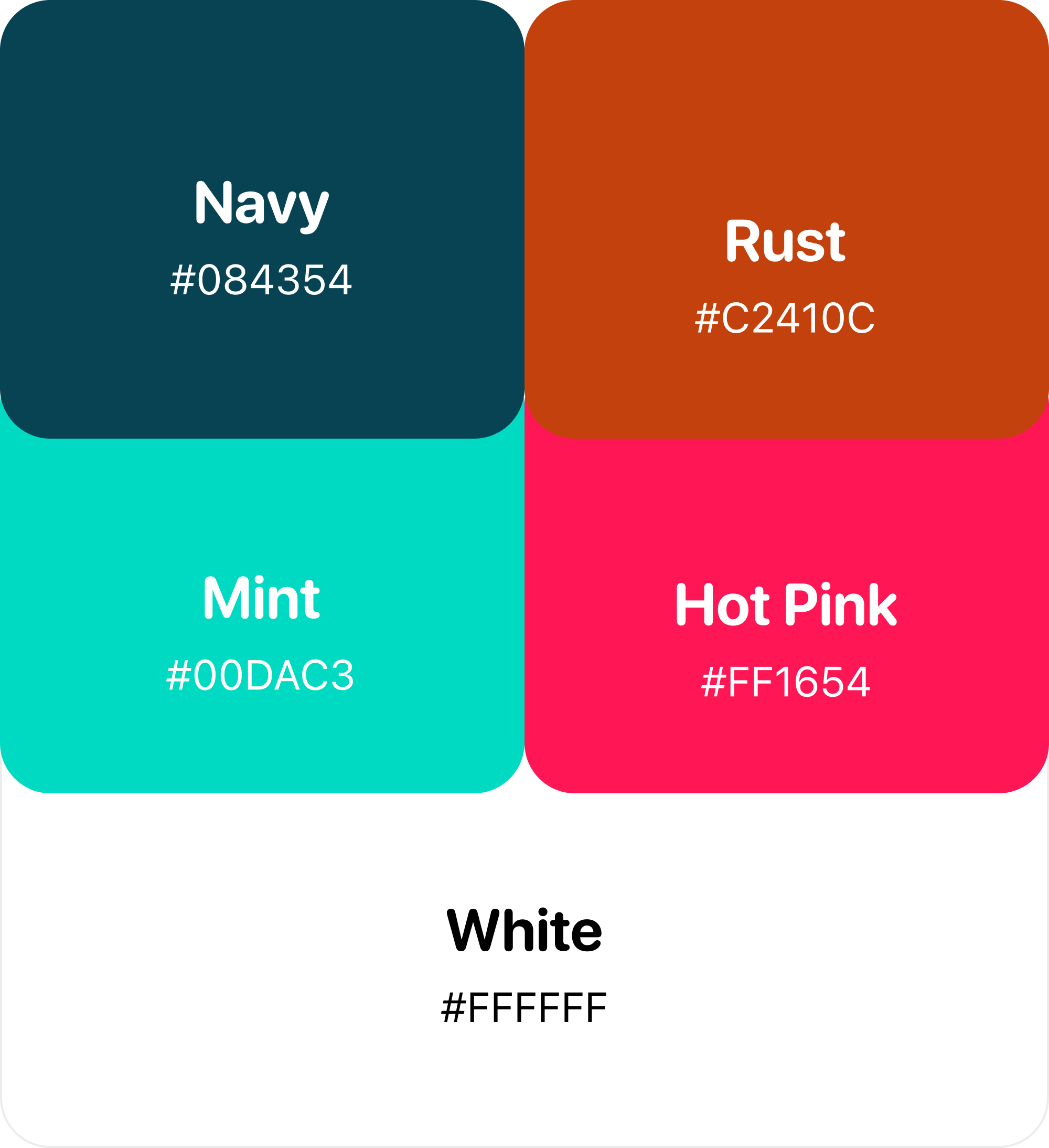
Moving away from traditional, pastel-heavy tracking apps, we established a masculine and grounded palette. We anchored the experience in Navy (#084354) and Rust (#C2410C) to ensure the tool felt like a supportive companion for the male user, while using Mint and Hot Pink as energetic functional highlights.
The "Connected" Identity
We crafted a logo that tells a story of unity. The two interconnected loops represent two individuals in a partnership; together, they form a heart, symbolizing the stronger connection that occurs when communication and timing are in sync.

Typeface
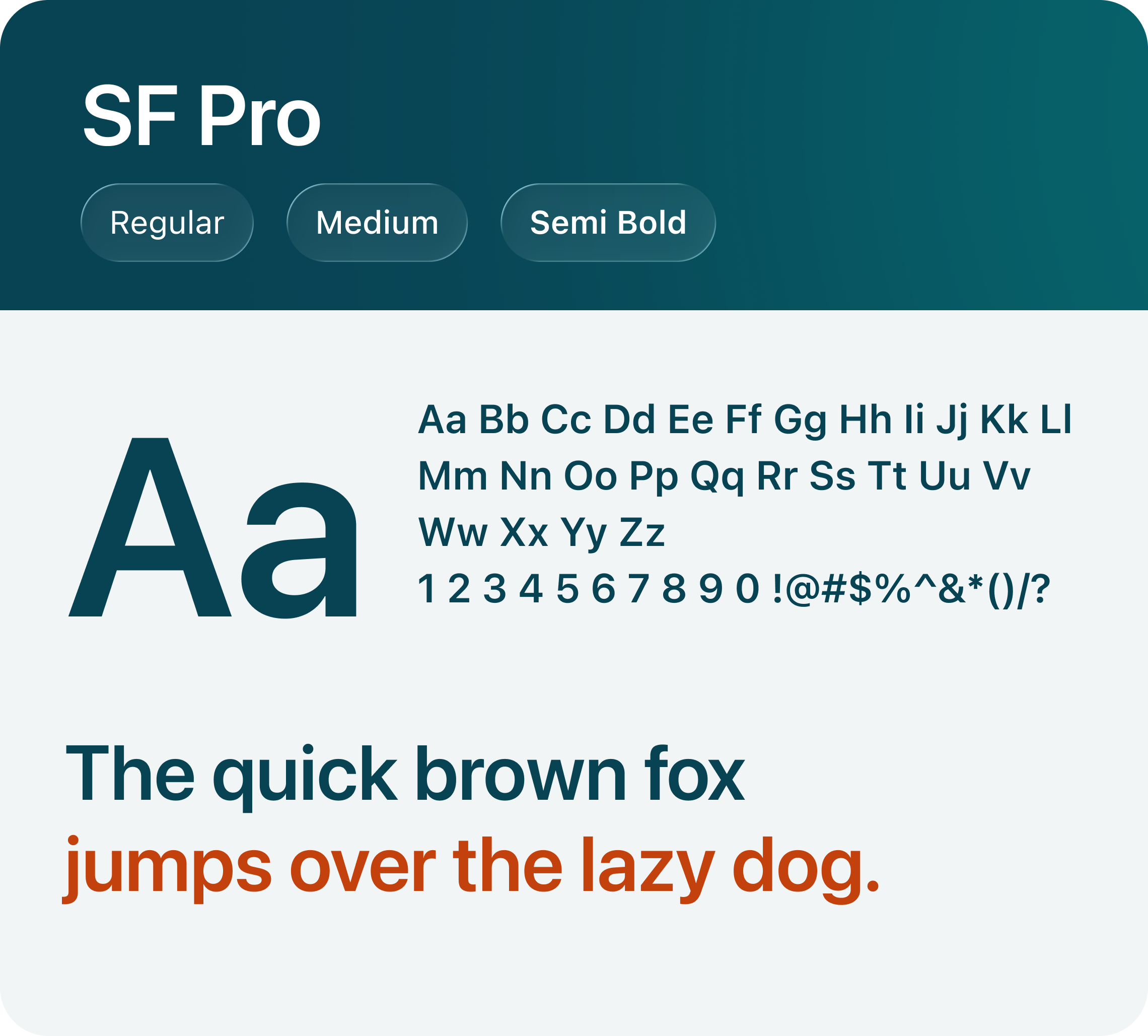
We utilized SF Pro Rounded for both headers and body copy. This choice was intentional: the rounded terminals provide a softer, more approachable “human” feel to the data, while the native iOS structure ensures the app feels familiar and professional from the first interaction.

Colour palette
Bypassing traditional pastels, we anchored the UI in grounded Navy and Rust to appeal to the masculine user. These primary tones are balanced with energetic Mint and Hot Pink accents, crafting an intuitive, high-end aesthetic that feels like a trusted advisor.
The Conclusion
KnowWhen successfully translates complex biological rhythms into actionable relationship insights. By focusing on simple interactions and a masculine-centric design language, we delivered an MVP that doesn’t just track data—it strengthens marriages.
We replaced complexity with clarity, designing a strategic interface that turns data into relational harmony.