

Table of Contents
- Introduction
- What is Yellowbrick
- Visualize the Data
- Visualize the Results of the Model
- How to Improve the Model
- Conclusion
Introduction
Imagine you’re a building manager deploying an occupancy detection system. Sensors throughout the building measure temperature, humidity, light, and CO2 levels.
Your model predicts room occupancy with an f1-score of 98%. This score reflects how well the model balances accurate predictions with catching all occupied rooms. But a single score hides important details.
When the system thinks a room is occupied, how often is it wrong? When people are actually in a room, how often does the system miss them? One wastes energy; the other frustrates occupants.
To improve, you need to see which error your model makes more often. This is where visualization helps. Charts and plots reveal patterns that raw numbers hide. Yellowbrick makes it easy to create these diagnostic plots.
For general-purpose plotting beyond ML diagnostics, see Top 6 Python Libraries for Visualization.
💻 Get the Code: The complete source code and Jupyter notebook for this tutorial are available on GitHub. Clone it to follow along!
What is Yellowbrick
Yellowbrick is a machine learning visualization library. Essentially, Yellowbrick makes it easier for you to:
- Select features
- Tune hyperparameters
- Interpret the score of your models
- Visualize text data
Visualizing your data and model helps you understand what’s working, what’s not, and what to fix next.
To install Yellowbrick, type:
pip install yellowbrick
We’ll use a room occupancy dataset to explore Yellowbrick’s classification tools. Sensors recorded temperature, humidity, light, and CO2 levels, while cameras captured ground-truth occupancy every minute.
from sklearn.model_selection import train_test_split
from sklearn.tree import DecisionTreeClassifier
from yellowbrick.datasets.loaders import load_occupancy
import warnings
warnings.filterwarnings('ignore')

X, y = load_occupancy()

# Create train/test split
X_train, X_test, y_train, y_test = train_test_split(X, y, random_state=42)
Visualize the Data
Rank Features
Correlated features can hurt your model by adding redundancy without new information. The Rank2D visualizer scores each pair of features using Pearson correlation, helping you spot which ones overlap.
from yellowbrick.features import Rank2D

visualizer = Rank2D(algorithm='pearson')
visualizer.fit(X, y)
visualizer.transform(X)
visualizer.show()
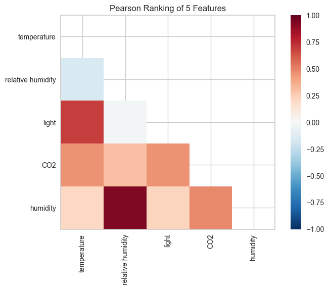
Two feature pairs show strong correlation (dark red cells):
- Humidity and relative humidity: The darkest red in the heatmap. Both capture air moisture, one as an absolute measure, the other adjusted for temperature. This likely explains the overlap.
- Light and temperature: Also dark red. This may be because daytime brings both sunlight and warmth. Occupied rooms possibly have lights on and more body heat.
Since correlated features carry redundant information, you could potentially drop one from each pair without losing predictive power.
Class Balance
Class imbalance distorts your metrics. When one class dominates the data, a model can score high by always guessing the majority class. A 98% f1-score means little if the model never correctly predicts the minority class.
The ClassBalance visualizer reveals whether your data has this problem:
from yellowbrick.target import ClassBalance


visualizer = ClassBalance(labels=["unoccupied", "occupied"])

visualizer.fit(y)        # Fit the data to the visualizer
visualizer.show()        # Finalize and render the figure
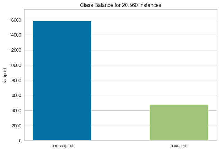
The chart shows a 3:1 imbalance: roughly 16,000 unoccupied samples versus 5,000 occupied. A model could achieve 75% accuracy by always predicting “unoccupied.”
To address this, consider:
- Stratified sampling: Split your data so both train and test sets maintain the same class ratio. This prevents the test set from accidentally having too few minority samples.
- Class weighting: Tell the model to penalize mistakes on the minority class more heavily. A missed occupied room costs more than a missed unoccupied one.
- Oversampling: Duplicate or synthetically generate more minority class samples to balance the dataset before training.
Visualize the Results of the Model
A single f1-score doesn’t tell you where your model succeeds or fails. These Yellowbrick visualizers break down your model’s performance so you can see exactly what’s happening.
Confusion Matrix
When the model predicts “occupied,” how often is it wrong? When a room is actually occupied, how often does the model miss it? The confusion matrix answers both questions at a glance.
from yellowbrick.classifier import ConfusionMatrix

# Specify the target classes
classes = ["unoccupied", "occupied"]

# Initialize the model
model = DecisionTreeClassifier()

# Fit and score the data
cm = ConfusionMatrix(model, classes=classes, percent=True)
cm.fit(X_train, y_train)
cm.score(X_test, y_test)
cm.show()
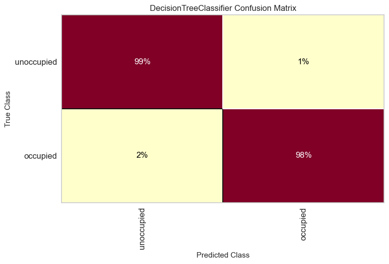
The model correctly identifies 99% of unoccupied rooms and 98% of occupied ones. The occupied class has slightly more errors (2% missed vs 1% false alarms).
To improve, focus on reducing missed occupied rooms since leaving people in the dark is worse than wasting a bit of energy.
Classification Report
The classification report answers four questions about your model’s predictions:
- Precision: When the model predicts “occupied,” how often is it right?
- Recall: Of all the actual “occupied” rooms, how many did the model find?
- F1: How well does the model balance precision and recall?
- Support: How many test samples are in each class?
from yellowbrick.classifier import ClassificationReport

visualizer = ClassificationReport(model, classes=classes, support=True)
visualizer.fit(X_train, y_train)
visualizer.score(X_test, y_test)
visualizer.show()

The heatmap reveals several insights:
- Both classes achieve perfect scores (1.0) for precision, recall, and F1
- The support column shows class imbalance: 3,958 unoccupied vs 1,182 occupied samples
- Darker cells indicate higher values, making underperforming metrics easy to spot
ROCAUC
Every classifier faces a tradeoff: catch more occupied rooms but risk more false alarms, or reduce false alarms but miss more occupied rooms. The ROC AUC curve shows this tradeoff across all possible thresholds.
The Y-axis shows the true positive rate; the X-axis shows the false positive rate. A model that hugs the top-left corner handles this tradeoff well.
from yellowbrick.classifier import ROCAUC

visualizer = ROCAUC(model, classes=classes)
visualizer.fit(X_train, y_train)
visualizer.score(X_test, y_test)
visualizer.show()

Both curves hug the top-left corner with AUC scores of 0.99. This means the model achieves near-perfect separation between classes with minimal false alarms.
The dotted diagonal represents random guessing (AUC = 0.5). Our curves are far from it, confirming strong performance. When comparing models, choose the one with curves closer to the top-left.
Discrimination Threshold
What if you want to catch every occupied room, even at the cost of some false alarms? Or minimize false alarms, even if you miss a few? The DiscriminationThreshold visualizer shows how each threshold affects precision, recall, and F1 score.
from yellowbrick.classifier import DiscriminationThreshold

visualizer = DiscriminationThreshold(model)
visualizer.fit(X, y)
visualizer.show()
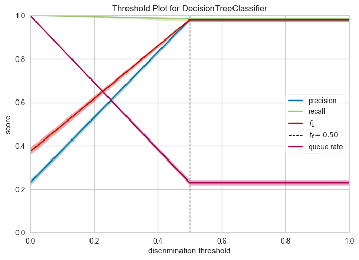
Key observations:
- The default threshold (0.50) achieves near-perfect precision and recall for this model
- F1 score remains high between thresholds 0.3-0.6, giving flexibility in threshold selection
- If minimizing false positives matters more, increase the threshold; if catching all positives matters more, decrease it
How to Improve the Model
Our model performs well, but can we do better? The next visualizers help you:
- Detect underfitting or overfitting
- Identify which features matter most
Validation Curve
How deep should your decision tree be? The answer depends on two failure modes:
- Too shallow (underfitting): The model is too simple to capture patterns. It performs poorly on both training and test data.
- Too deep (overfitting): The model memorizes training data instead of learning patterns. It performs well on training data but poorly on new data.
The ValidationCurve visualizer plots scores across different values, helping you find the sweet spot.
from yellowbrick.model_selection import ValidationCurve
import numpy as np

model = DecisionTreeClassifier()
viz = ValidationCurve(
    model,
    param_name="max_depth",
    param_range=np.arange(1, 11),
    cv=10,
    scoring="f1_weighted",
)
viz.fit(X, y)
viz.show()
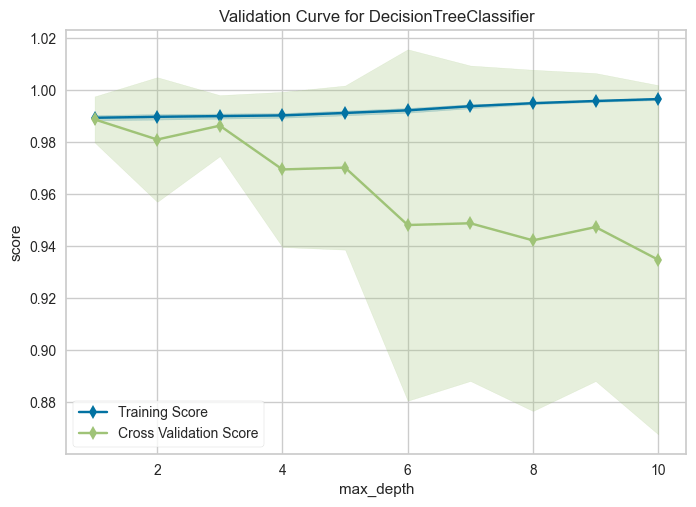
Training score improves with depth, but cross-validation score peaks at depth 1 and declines afterward. The growing gap means the model performs well on data it has seen but poorly on new data. This is the definition of overfitting.
Set max_depth=3 or max_depth=4 for good generalization with minimal overfitting.
Learning Curve
More data doesn’t always mean better performance. The LearningCurve shows how training and test scores change as you add more samples. Use it to decide whether collecting more data is worth the effort.
from yellowbrick.model_selection import LearningCurve

model = DecisionTreeClassifier()
viz = LearningCurve(model, cv=10, scoring="f1_weighted")
viz.fit(X, y)
viz.show()
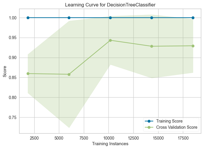
Training score stays flat at 1.0 regardless of sample size. Cross-validation score rises from 0.86 to a peak around 0.94 at ~10,000 samples, then slightly drops and plateaus.
This suggests the model benefits from more data up to a point, but beyond ~10,000 samples, additional data doesn’t improve generalization.
Feature Importances
Not all features contribute equally. Some add noise without improving predictions. The FeatureImportances visualizer ranks features by their contribution to the model, helping you identify which ones to keep and which to drop.
from yellowbrick.model_selection import FeatureImportances

model = DecisionTreeClassifier()
viz = FeatureImportances(model)
viz.fit(X, y)
viz.show()
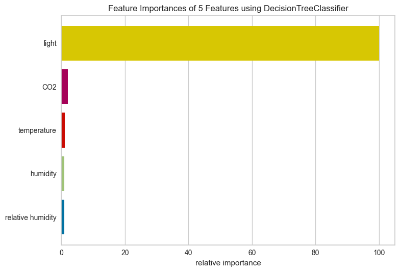
Light dominates with nearly 100% relative importance. CO2 and temperature contribute minimally, while humidity and relative humidity barely register.
Several factors could explain light’s dominance:
- Lights are typically switched on when rooms are occupied
- Natural daylight patterns may correlate with occupancy schedules
- Light sensors may have less noise than other sensors
For this dataset, you could likely drop humidity features with little impact on performance.
Conclusion
Yellowbrick turns model evaluation from numbers into visuals. You’ve seen how to:
- Spot data issues with Rank2D and ClassBalance
- Diagnose model errors with confusion matrices and ROC curves
- Tune hyperparameters with validation and learning curves
- Identify important features to simplify your model
Explore more visualizers in the Yellowbrick documentation.
Related Tutorials
- Testing: Pytest for Data Scientists to verify model behavior programmatically
- Presentation: Great Tables to present model metrics in publication-ready tables
📚 Want to go deeper? Learning new techniques is the easy part. Knowing how to structure, test, and deploy them is what separates side projects from real work. My book shows you how to build data science projects that actually make it to production. Get the book →


